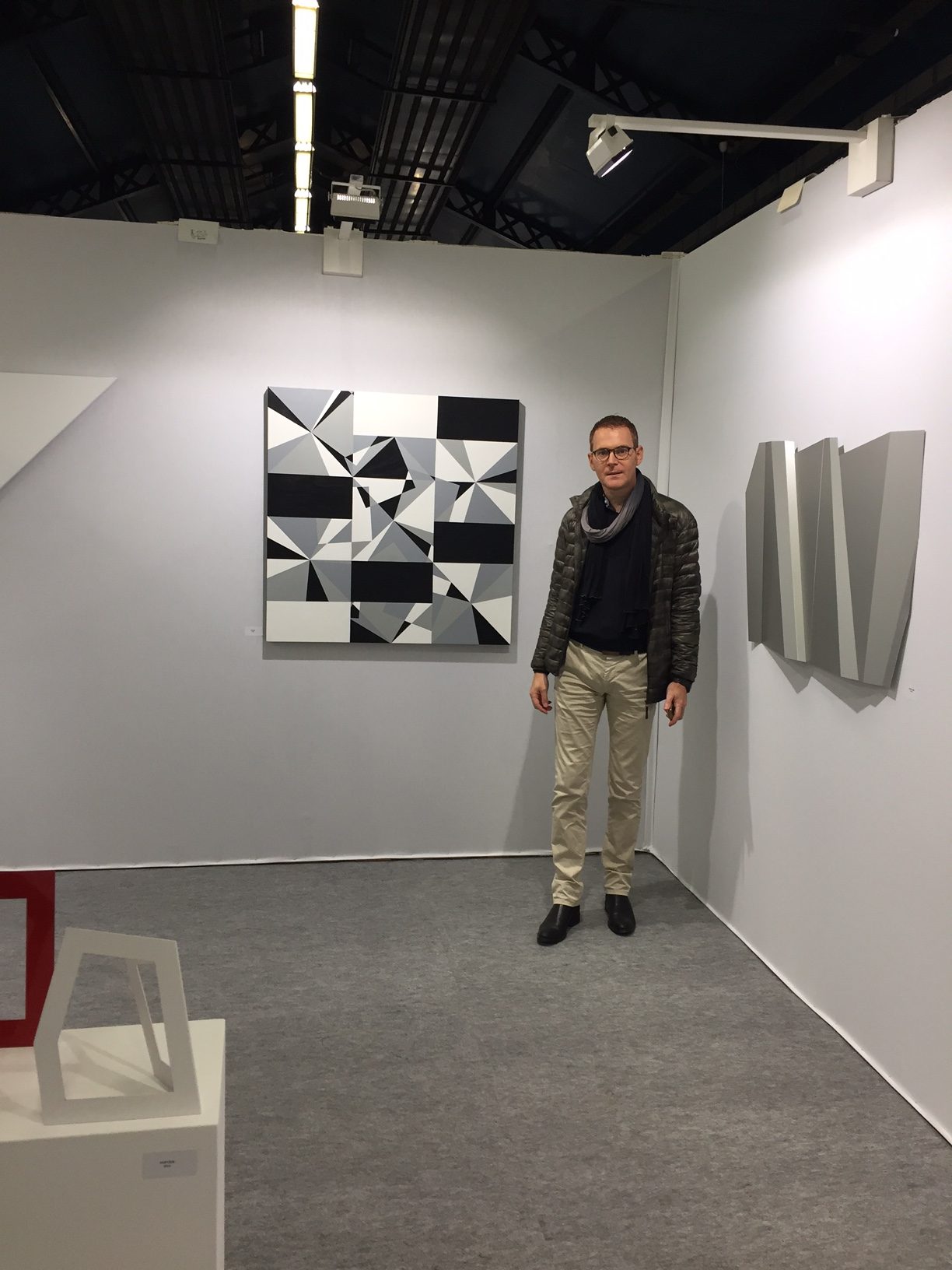
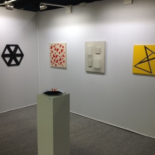
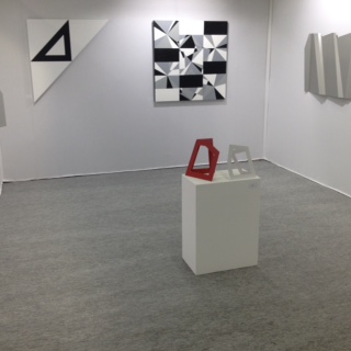
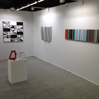
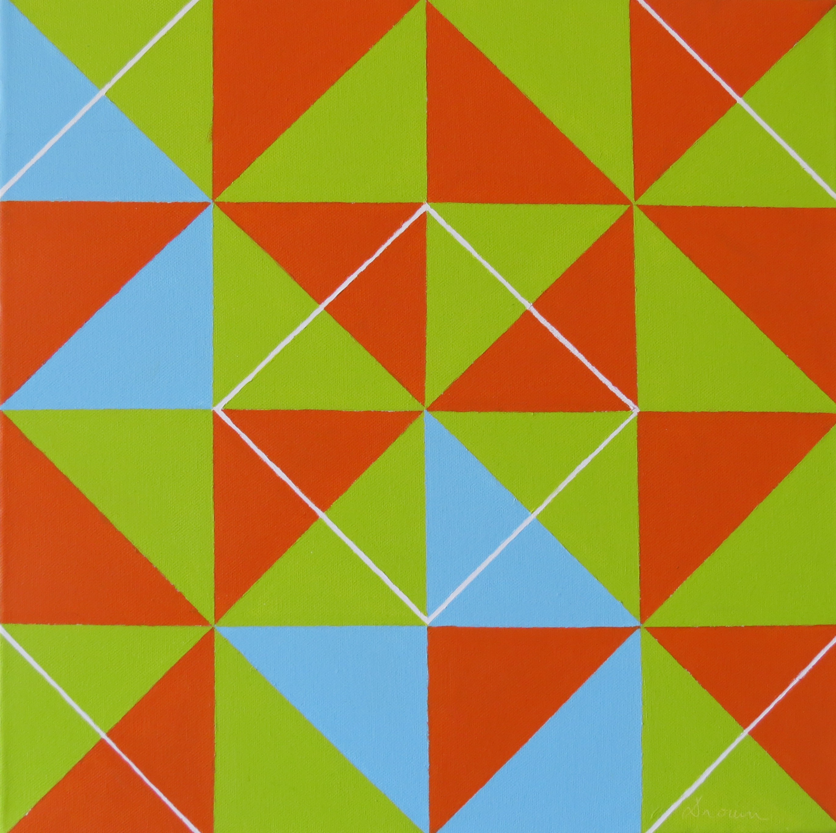
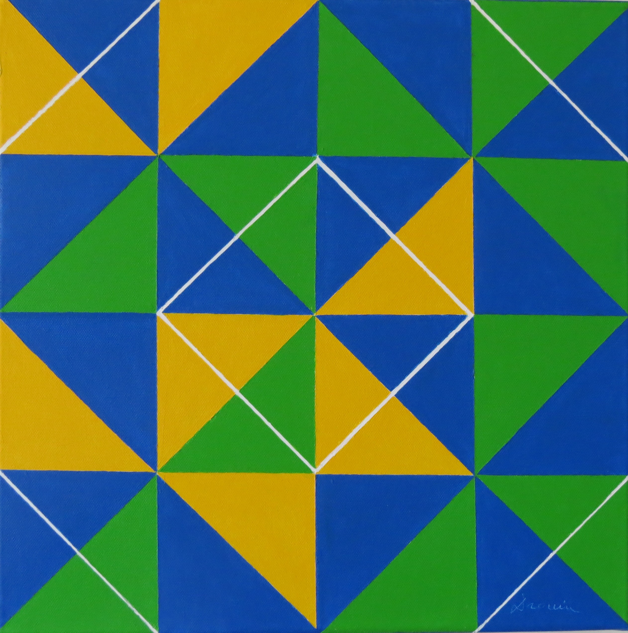
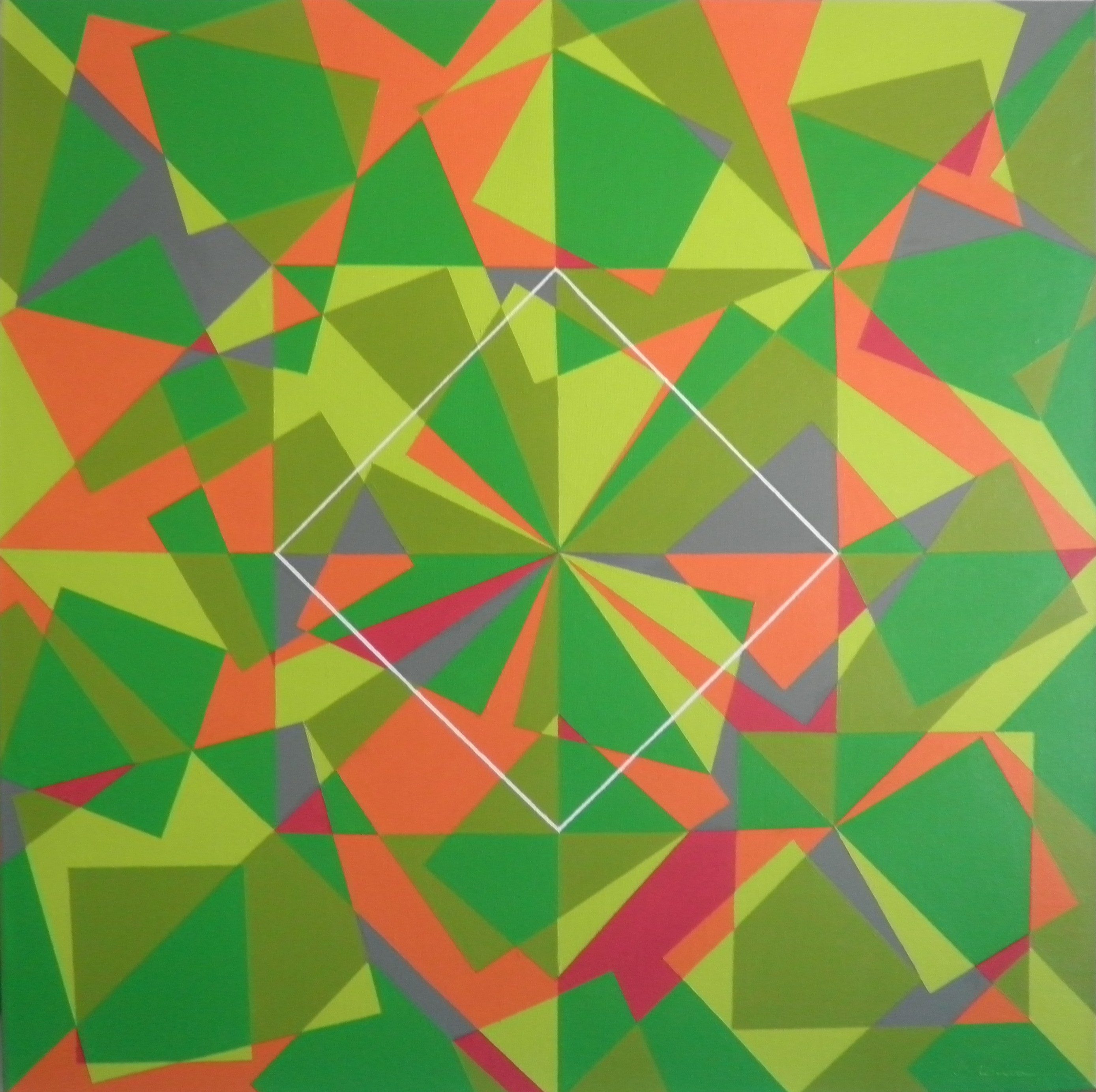
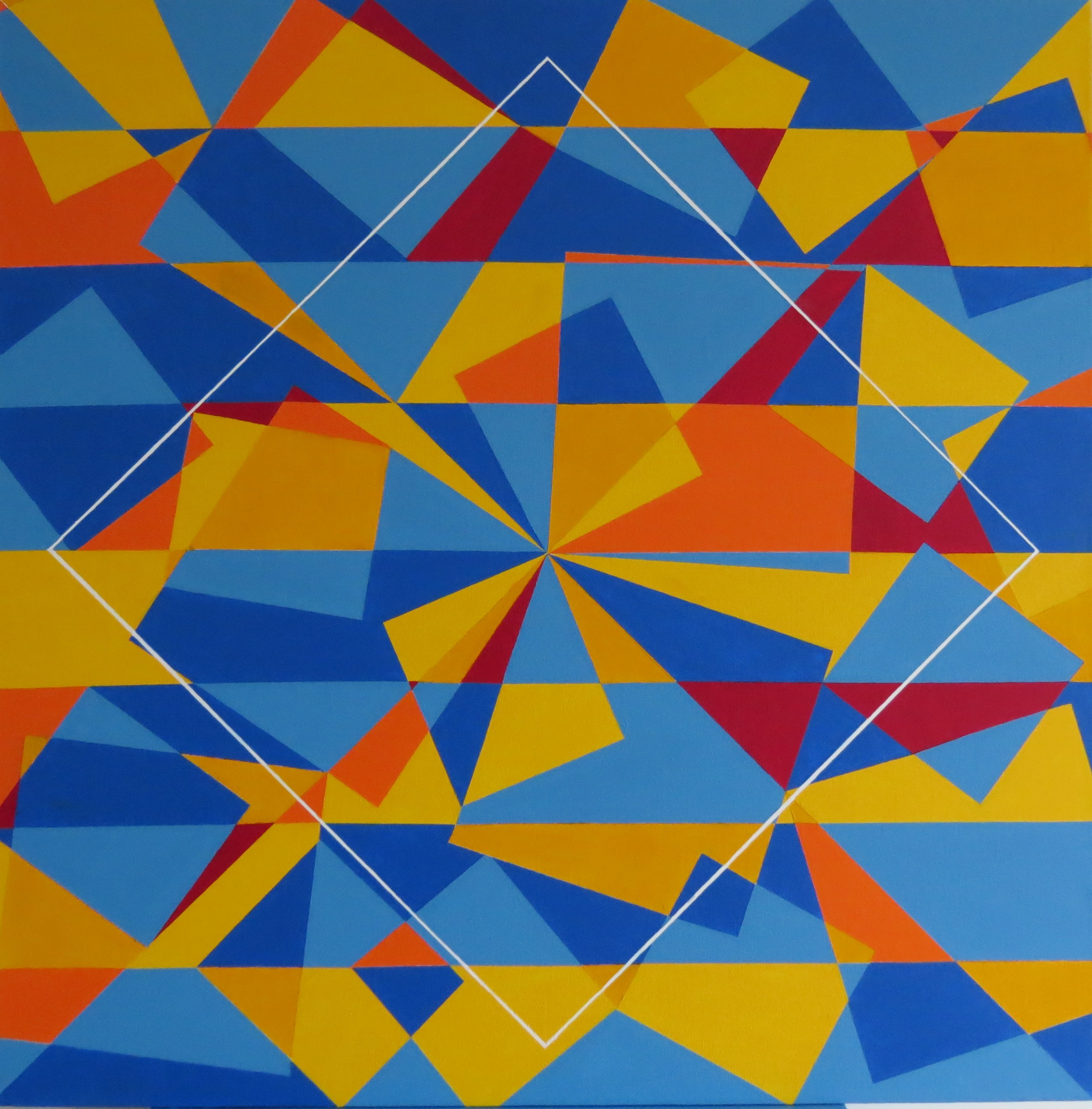
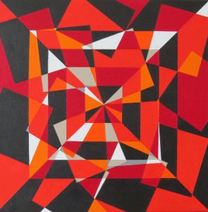
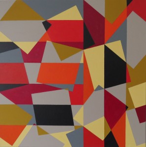
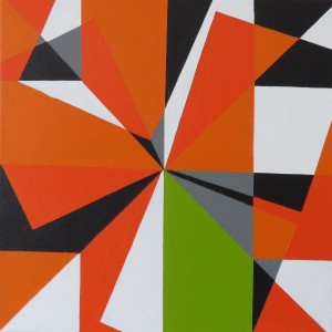
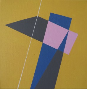
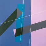
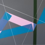
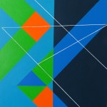
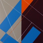
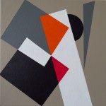
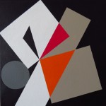
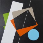
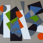
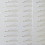
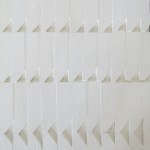
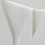
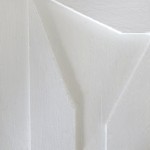
Note that you can click on the images to view them with a better resolution
Paris, November 20, 2016
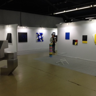
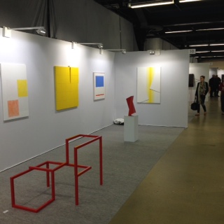
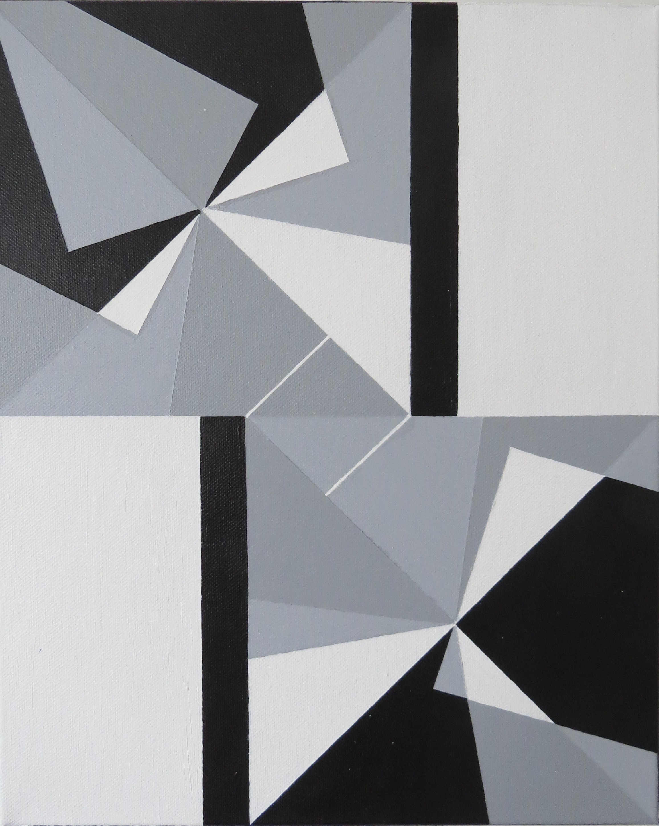
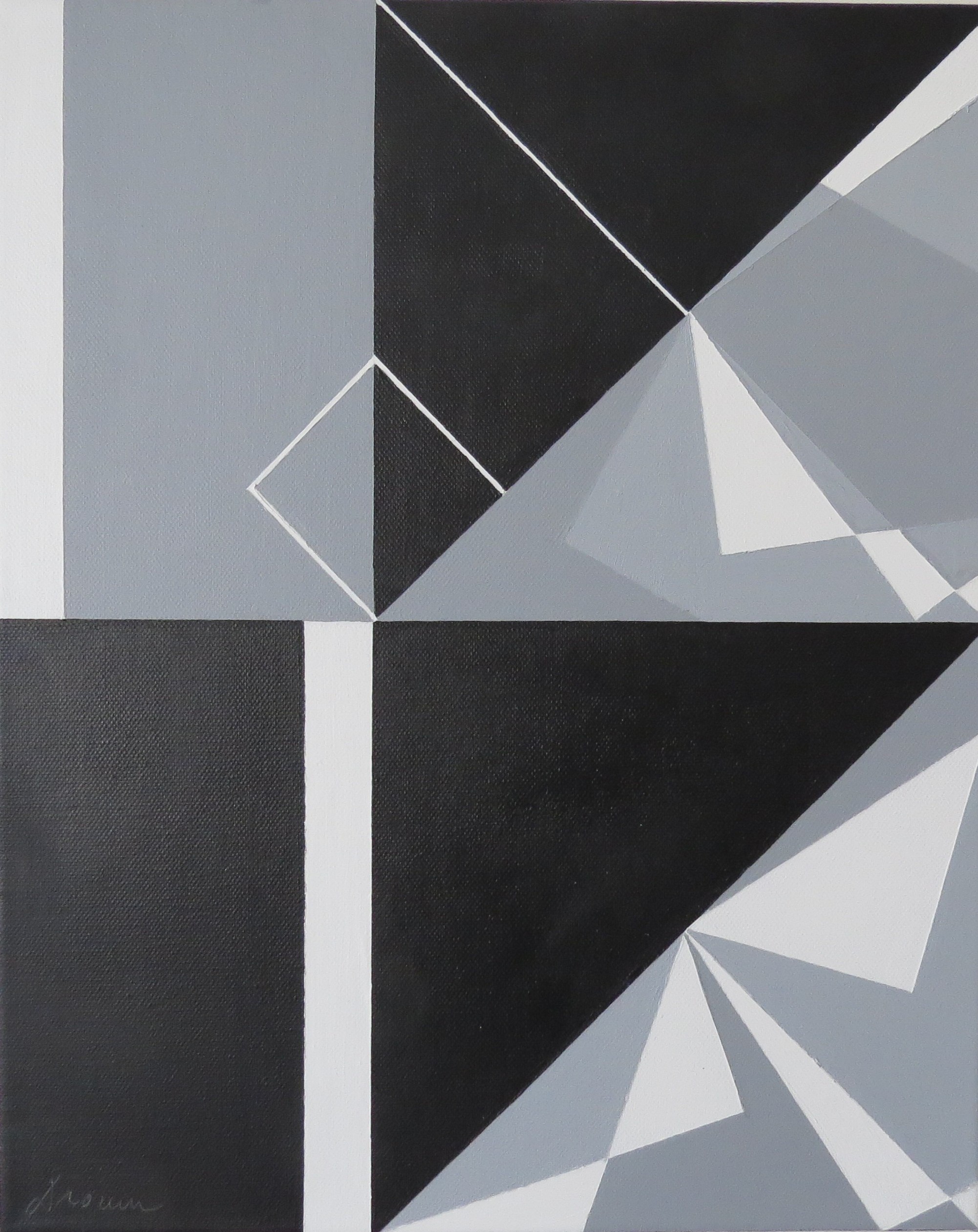
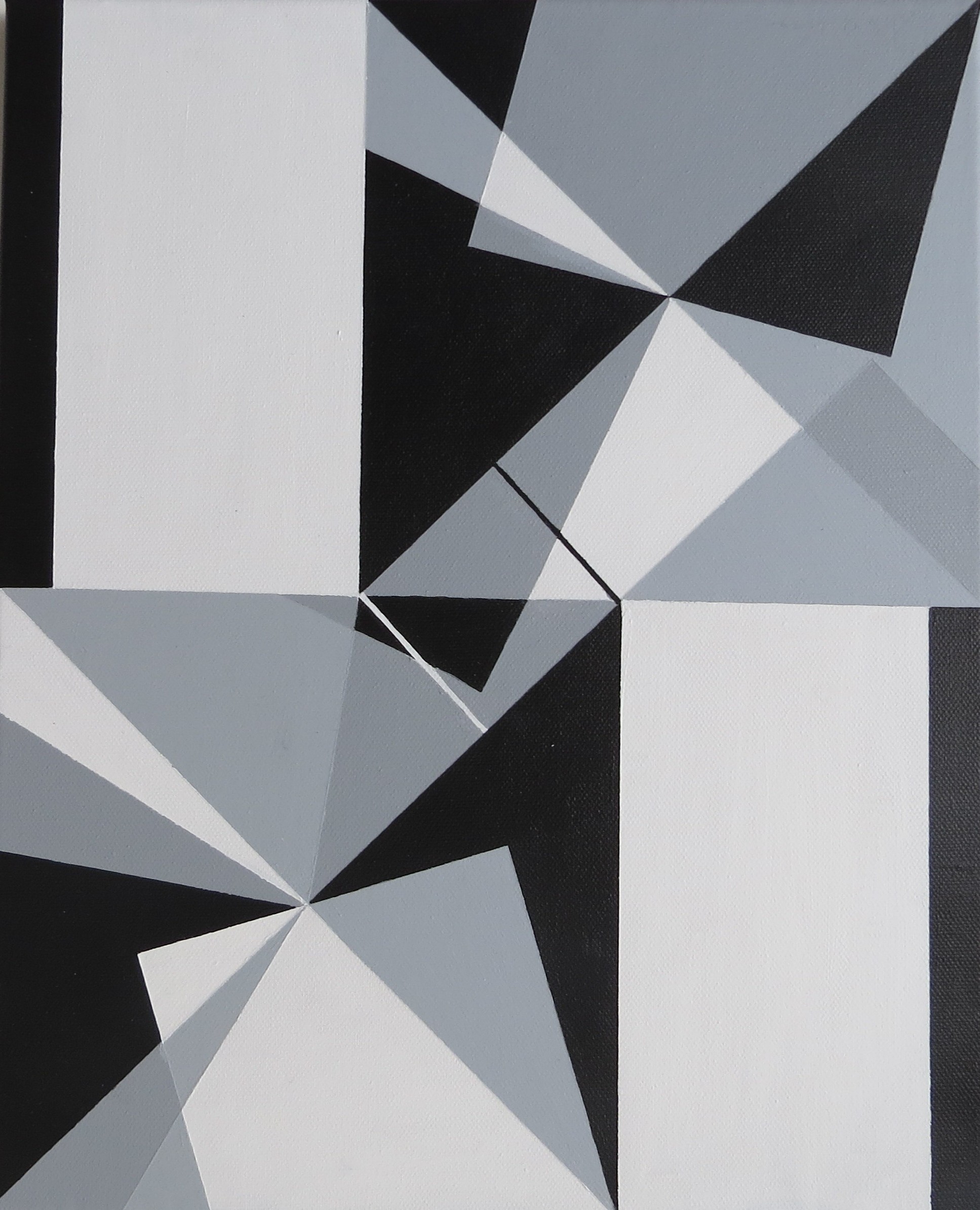
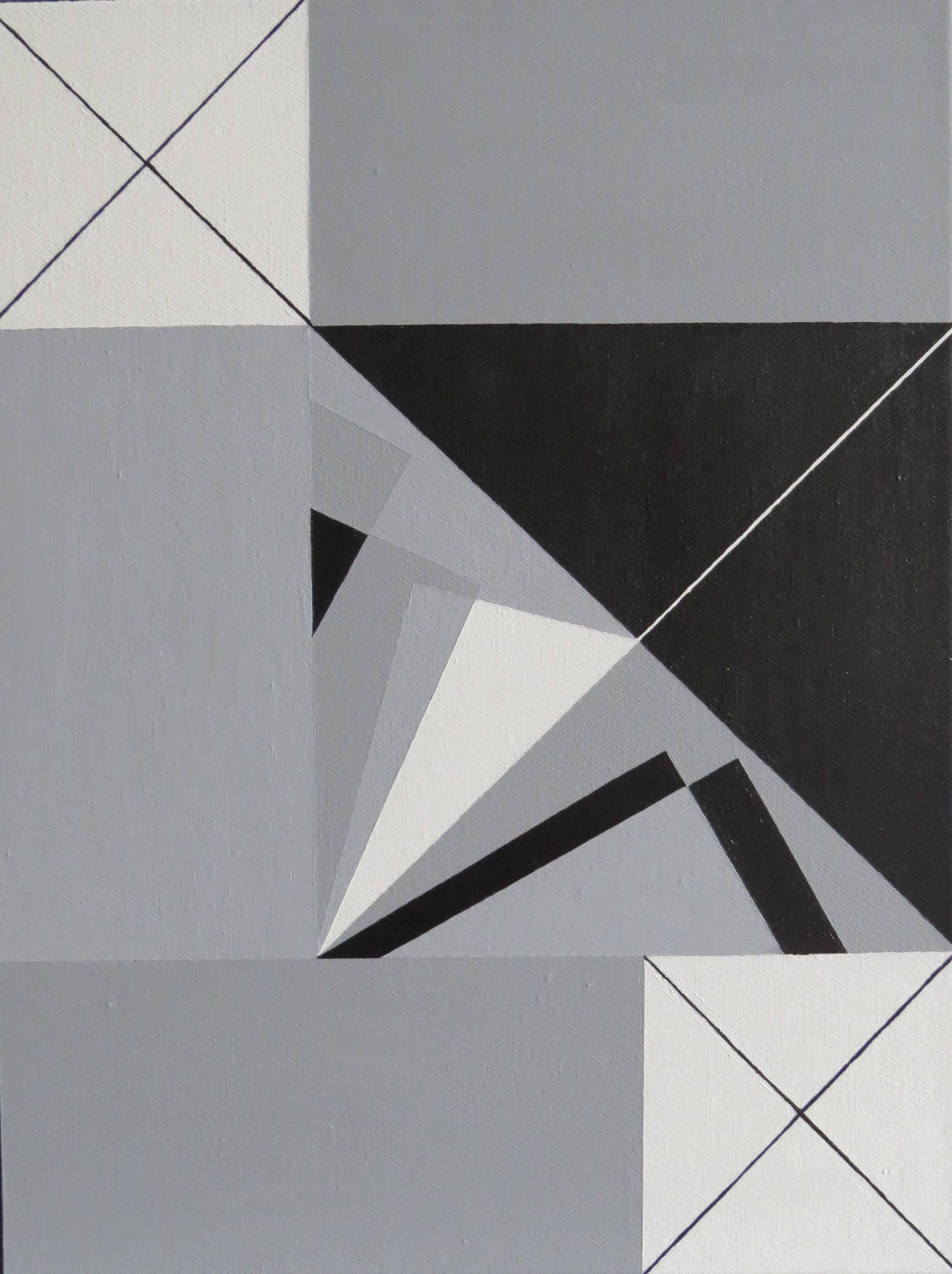
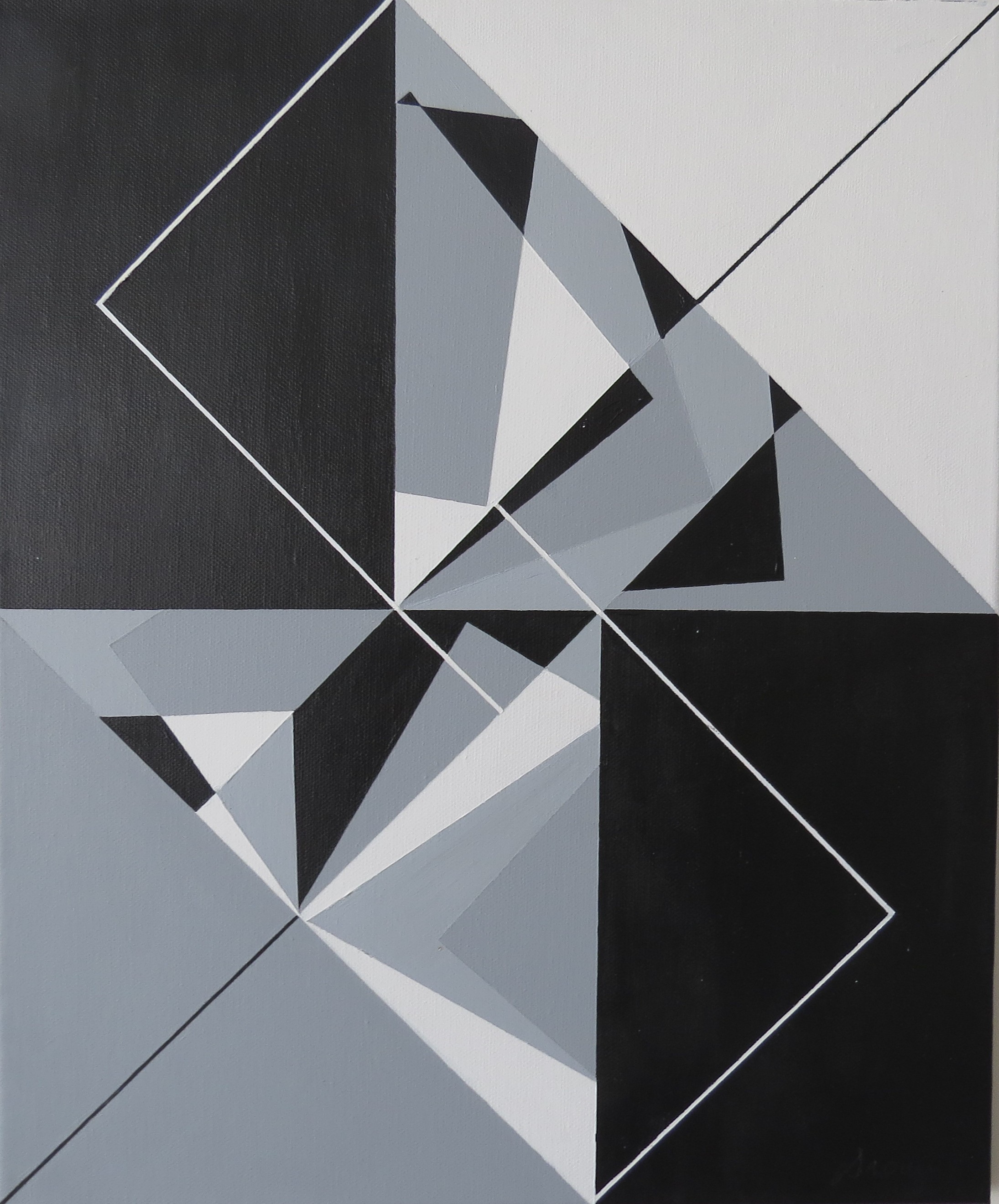
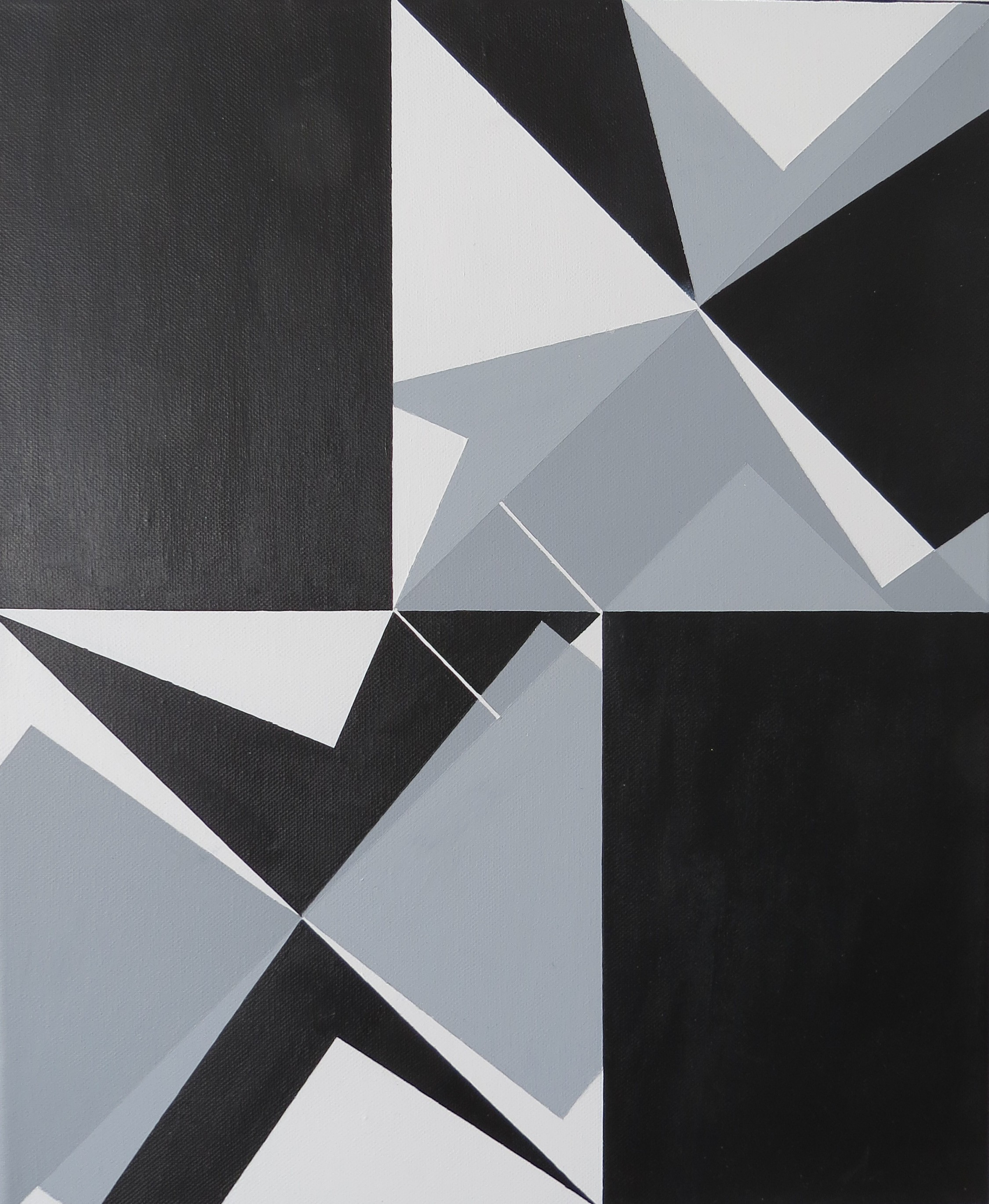
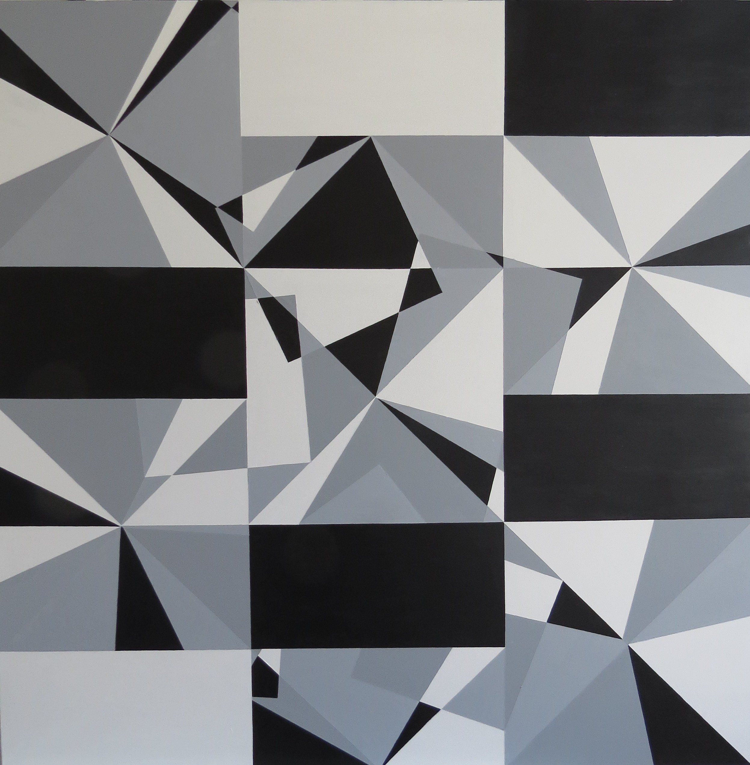
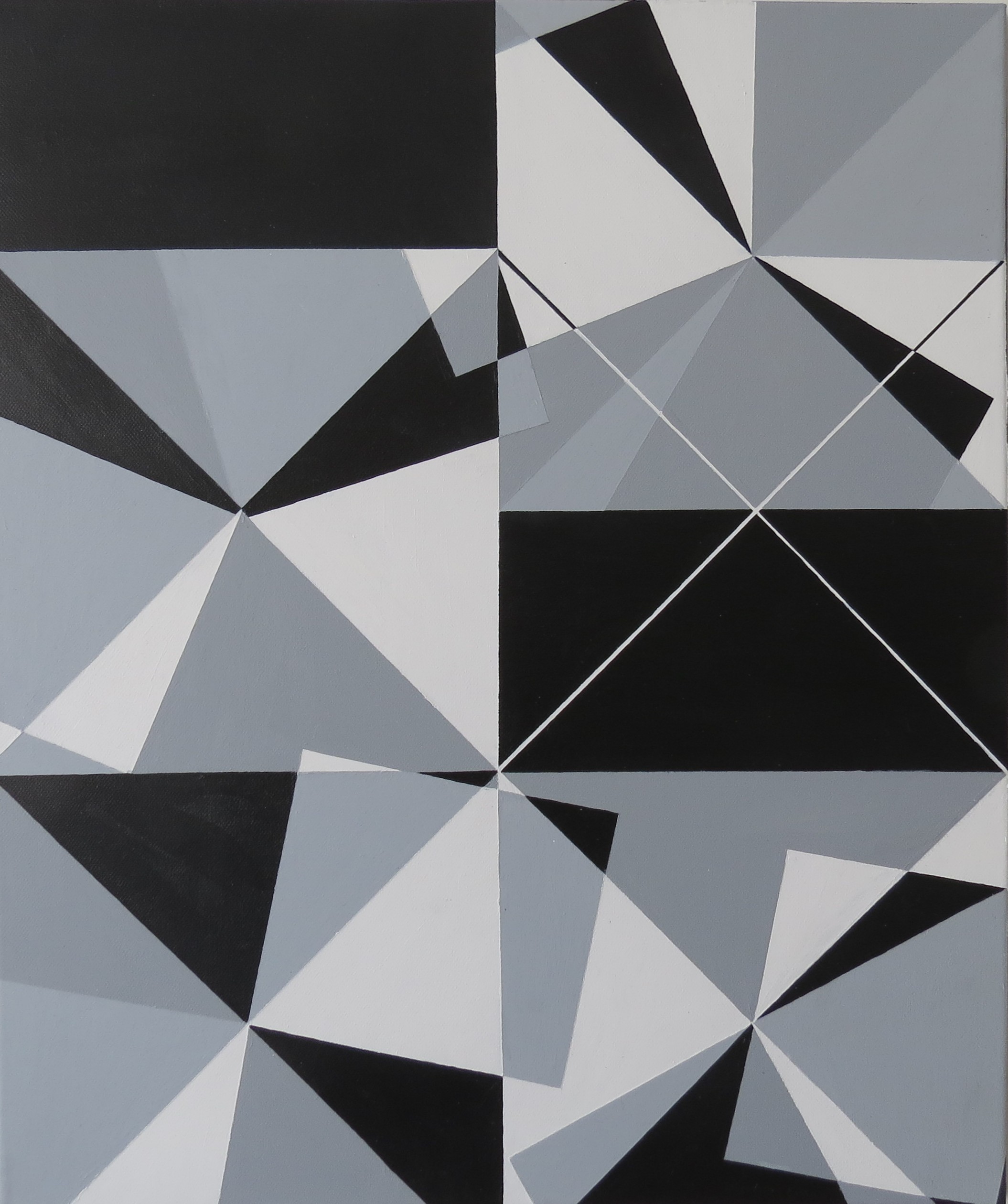
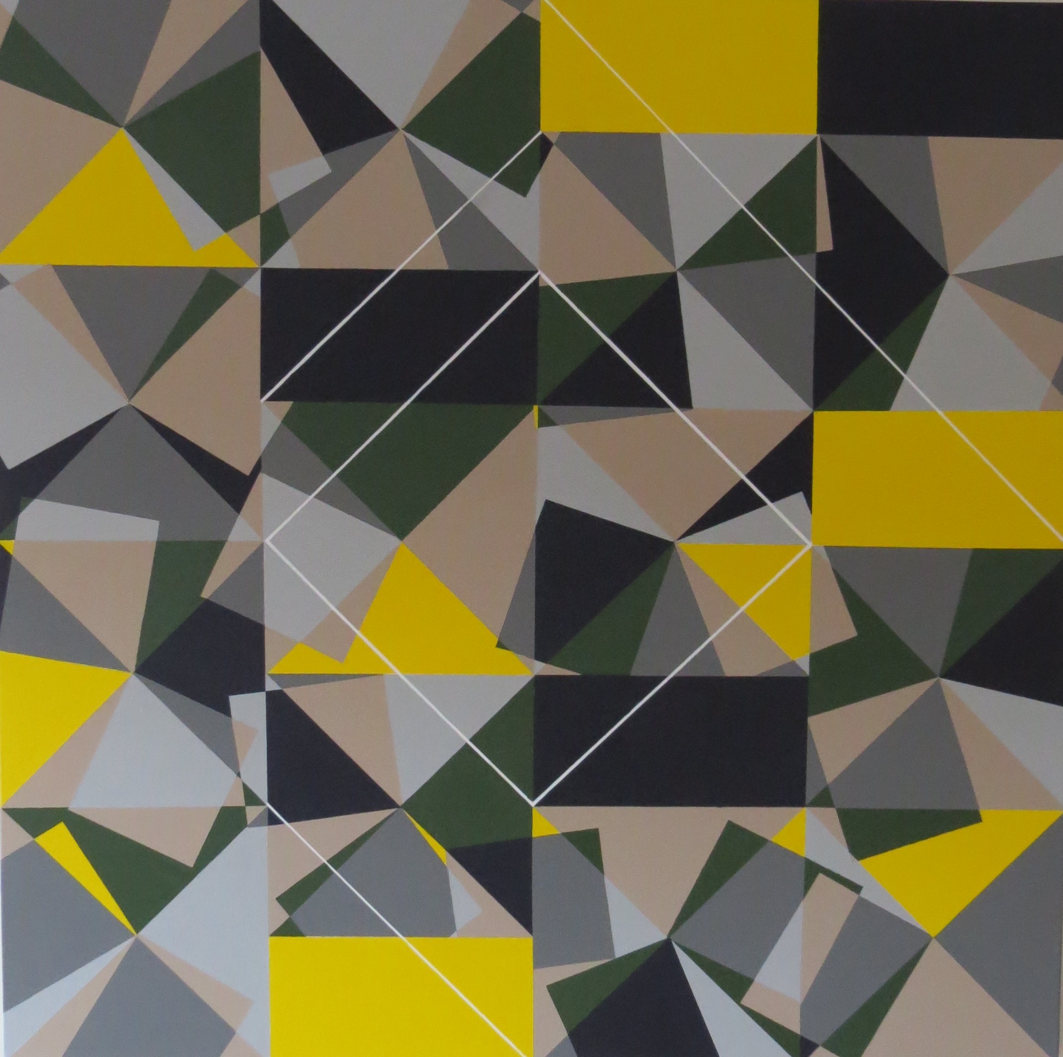
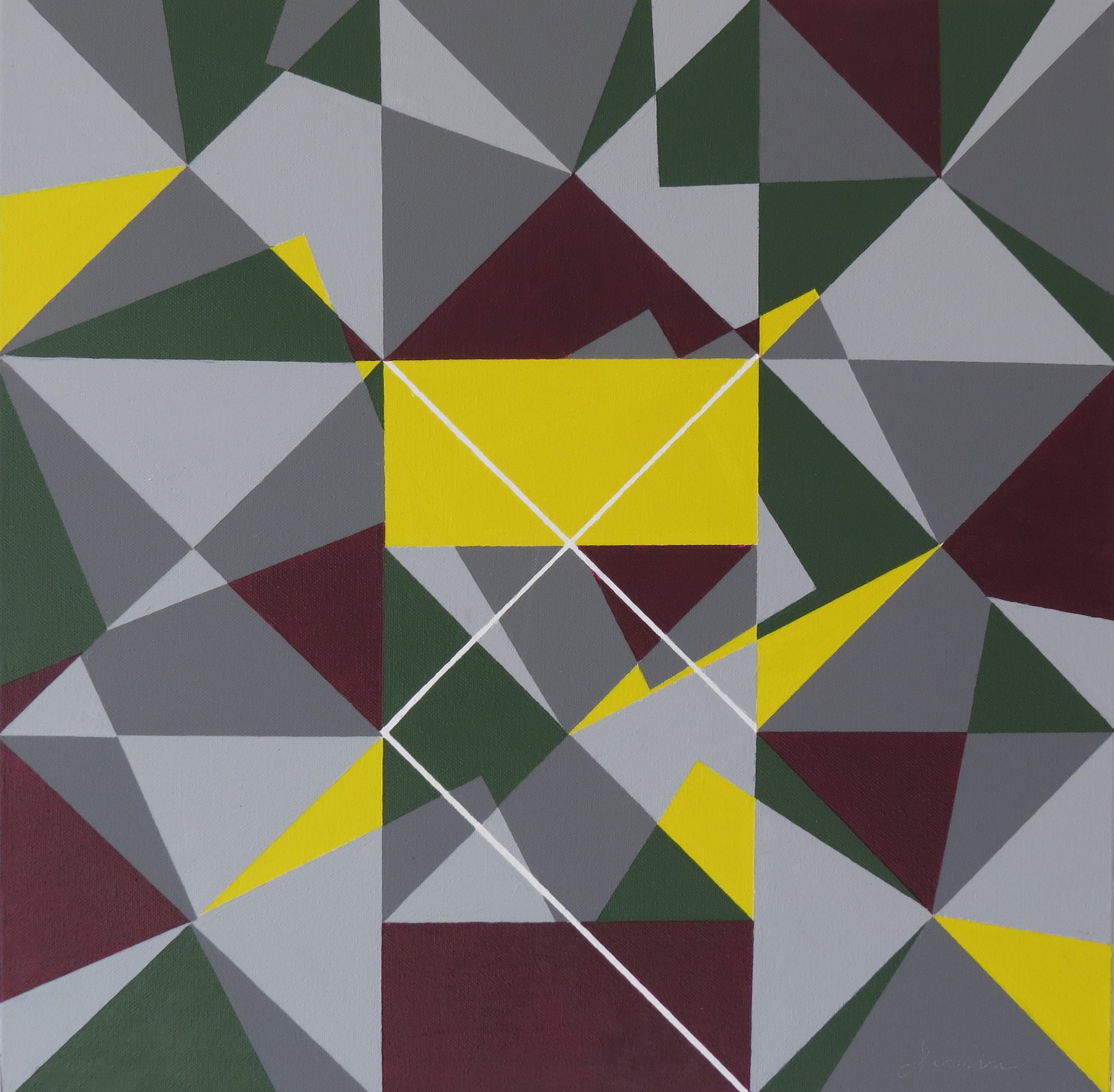
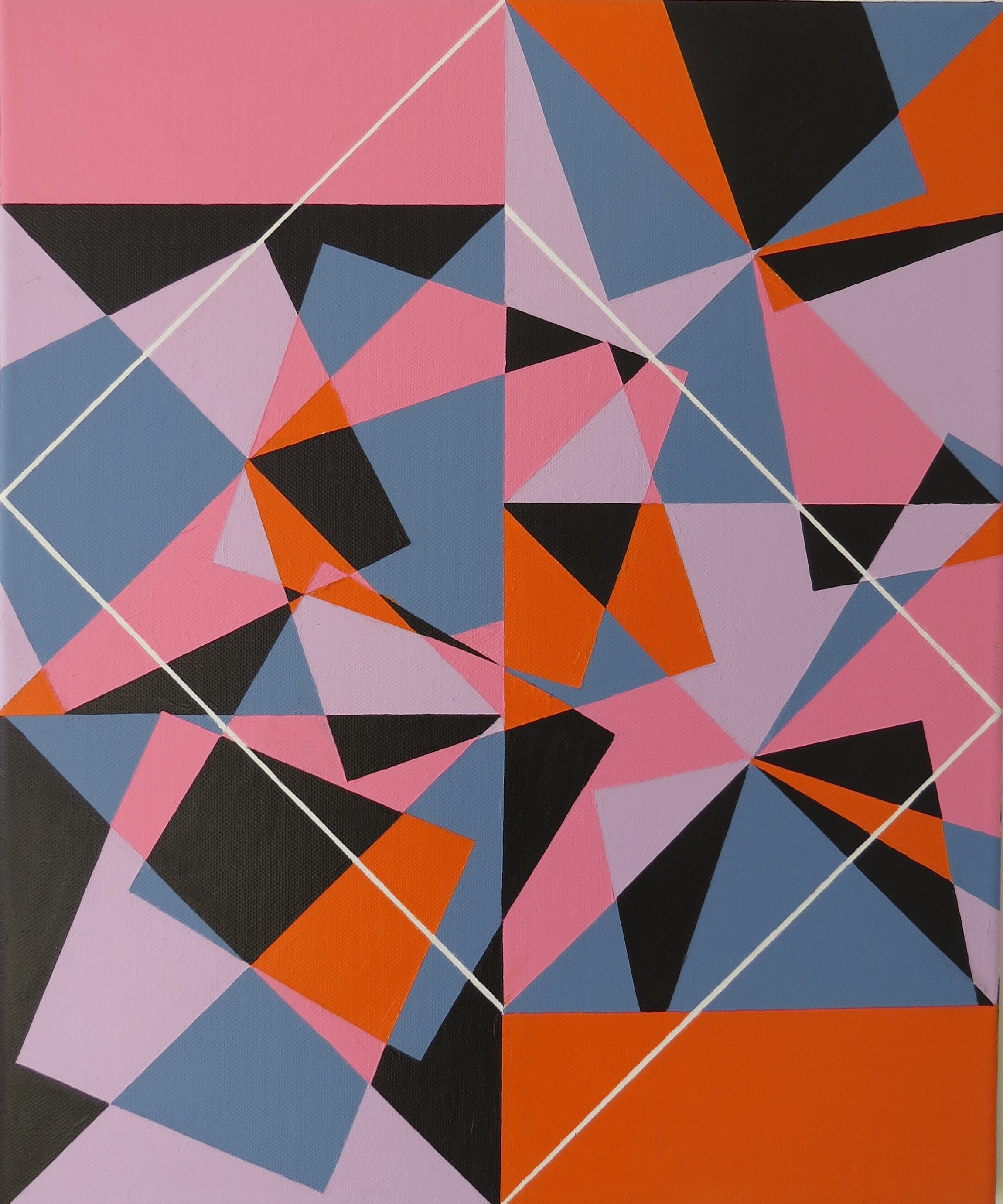
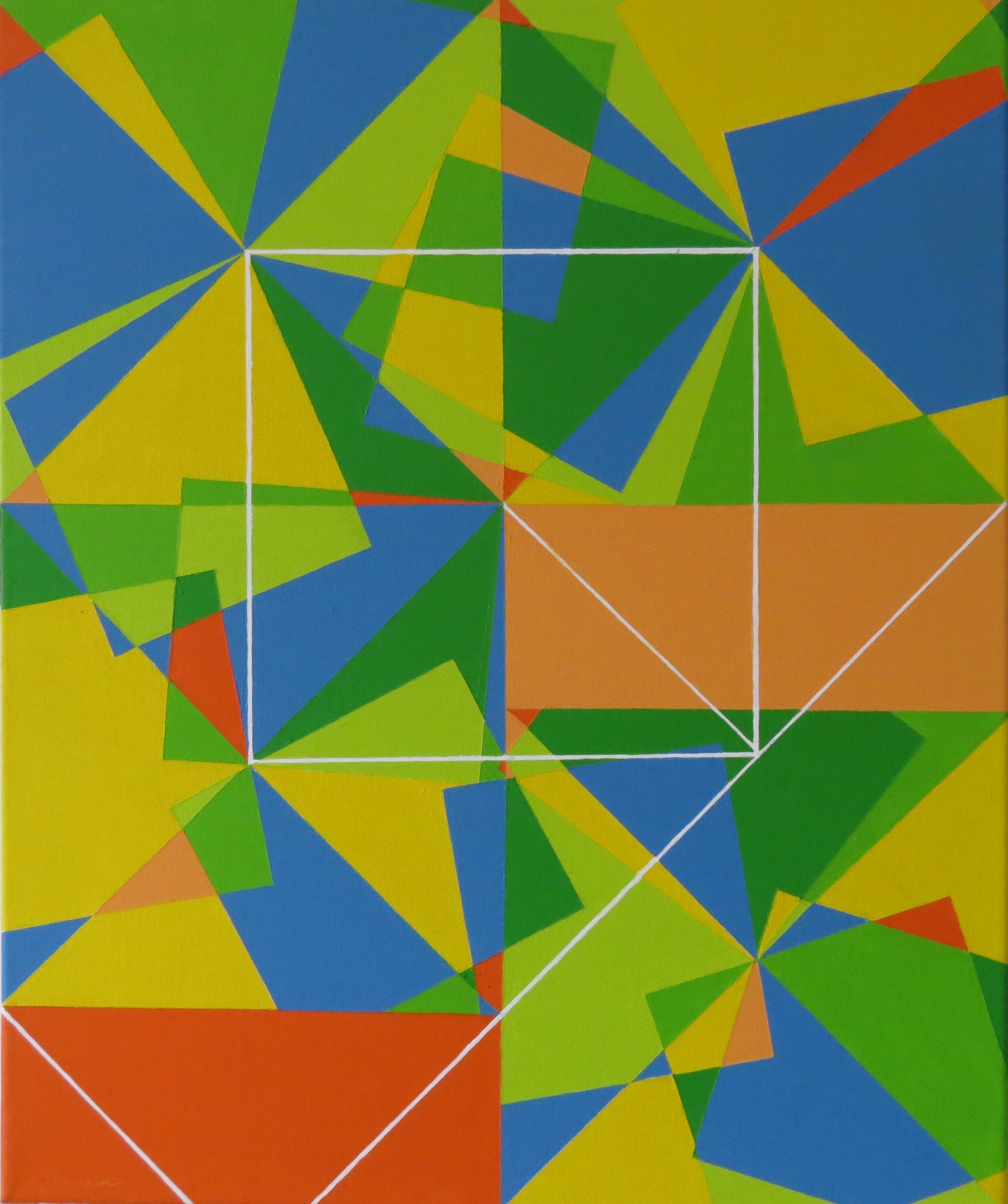
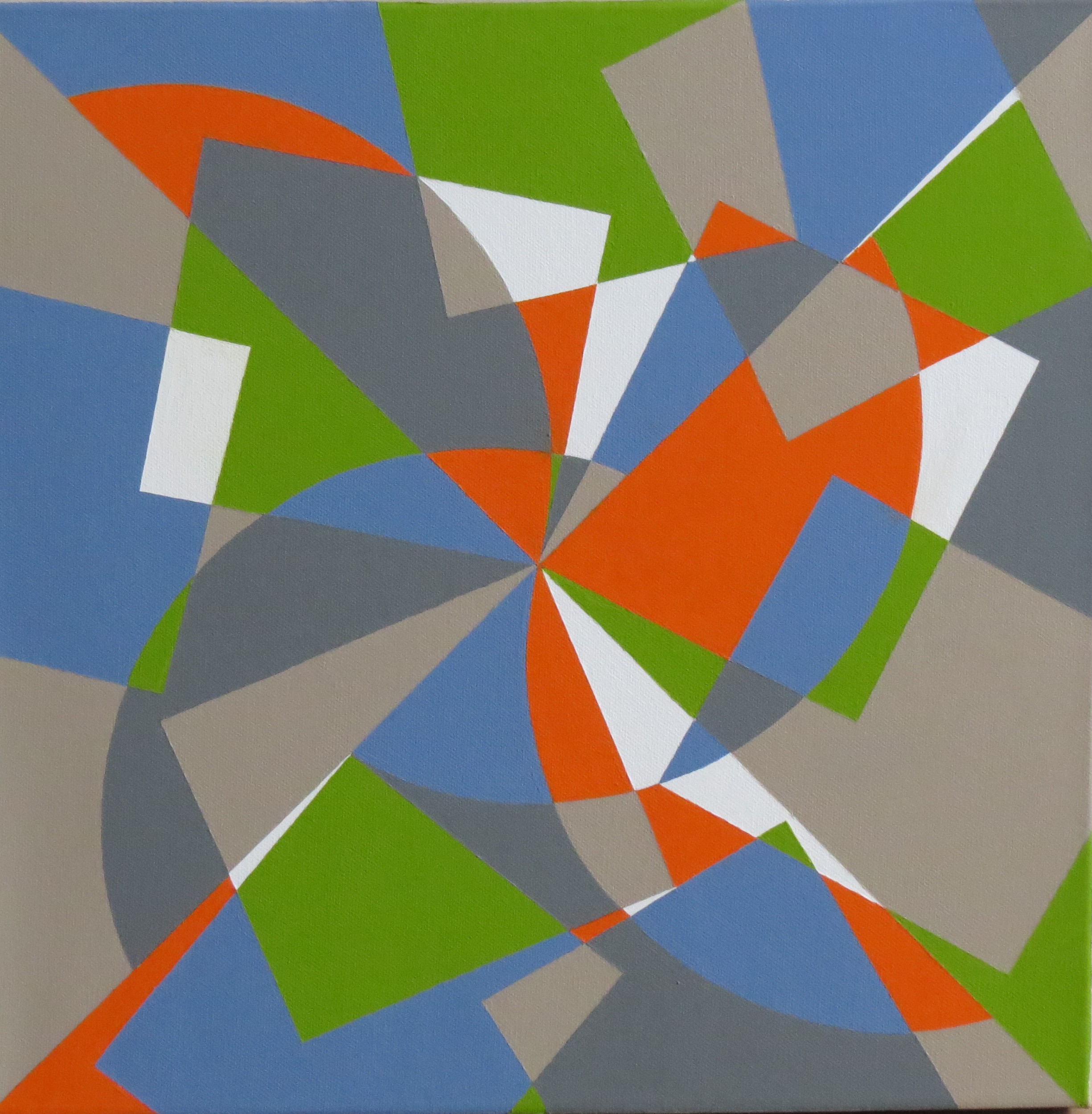
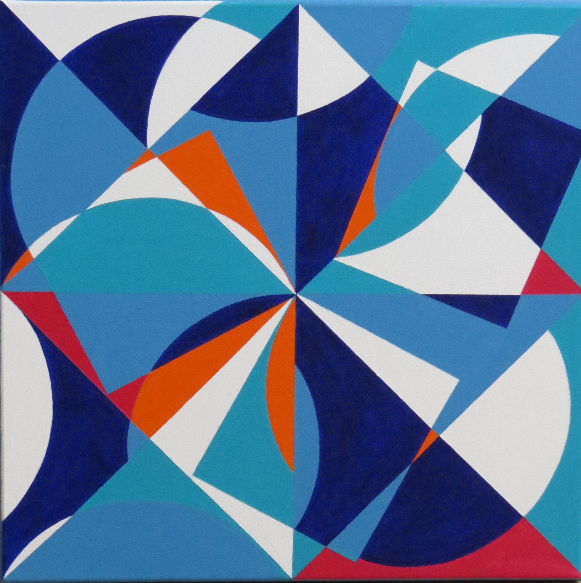
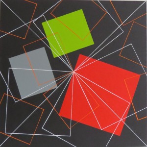
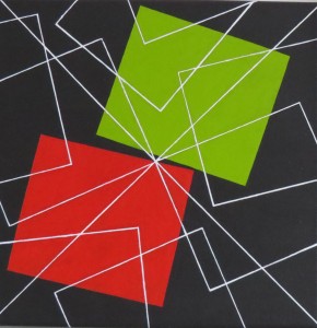
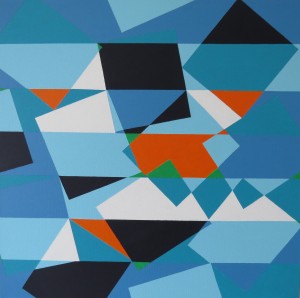
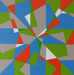
Please find below some pictures of the Réalités Nouvelles salon, where I was invited to show my work :
Paris, June 26, 2016
I will be present at the « salon international d’art abstrait contemporain de Paris, Réalités Nouvelles », from 16 to 23 October 2016. It will be the Salon’s 70th edition.
http://www.realitesnouvelles.org/exposants/2009.php?id=1237&artiste=drouin-gilles
Paris, June 19, 2016
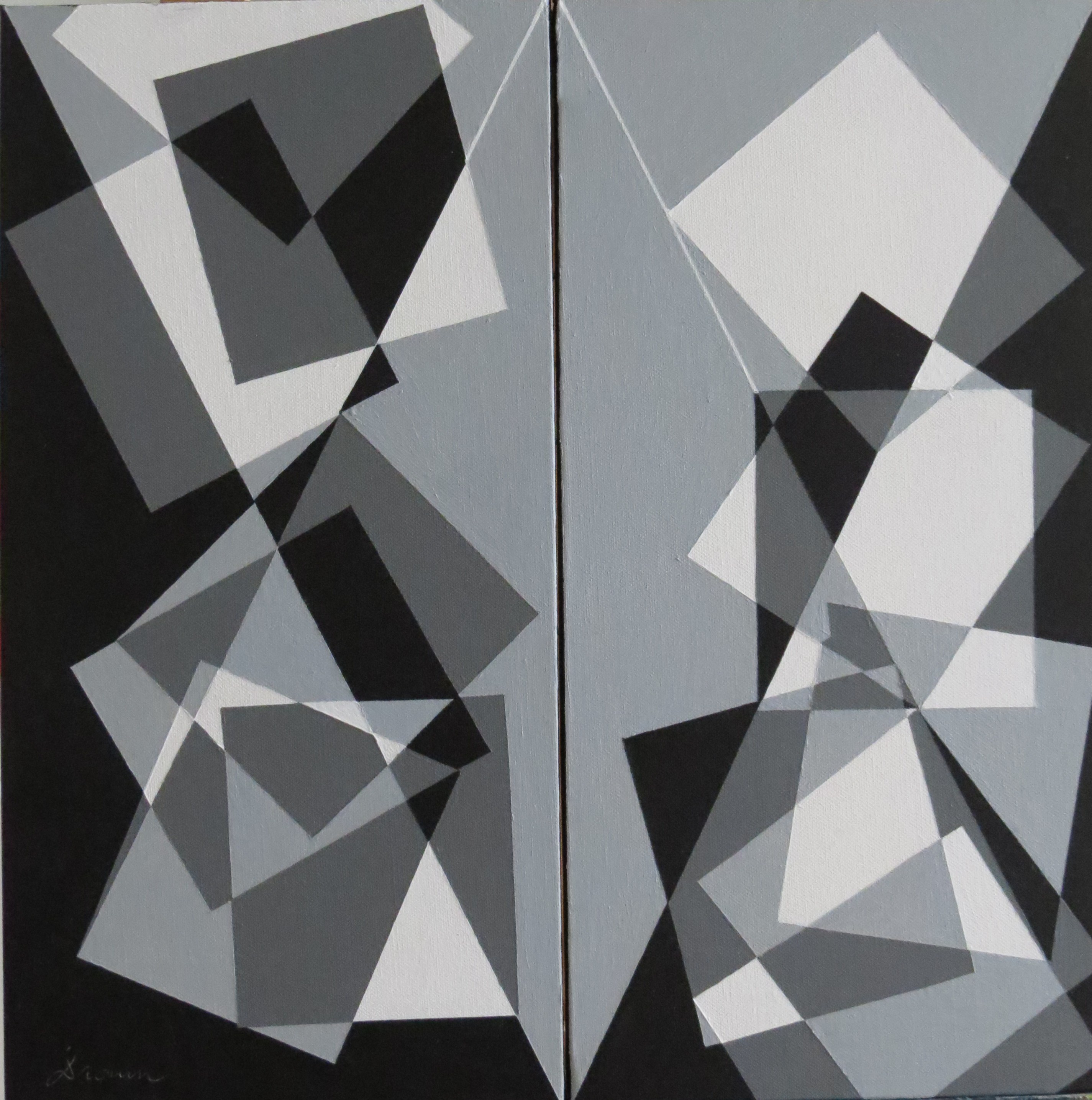
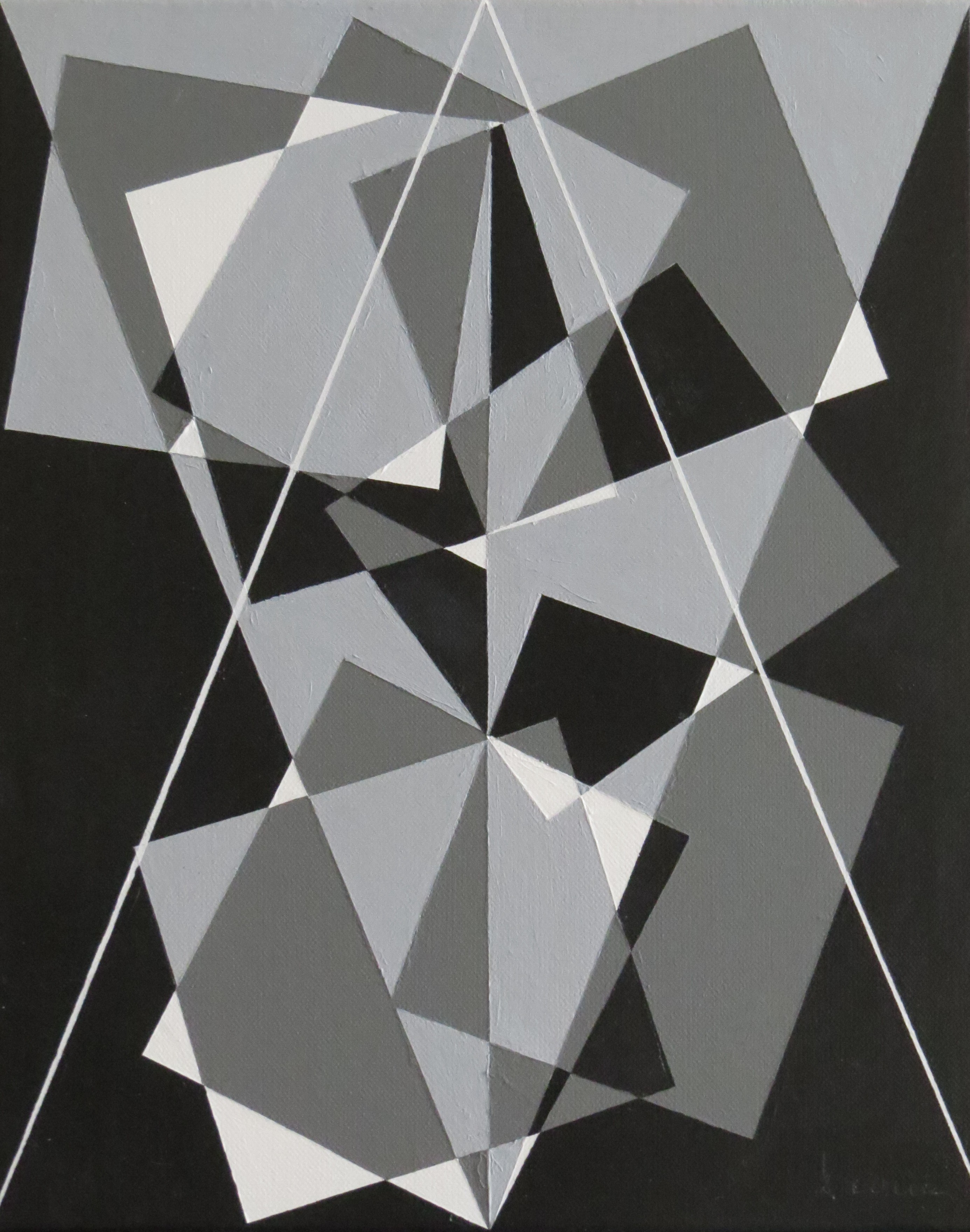
Some additional paintings, continuing the black & white effort.
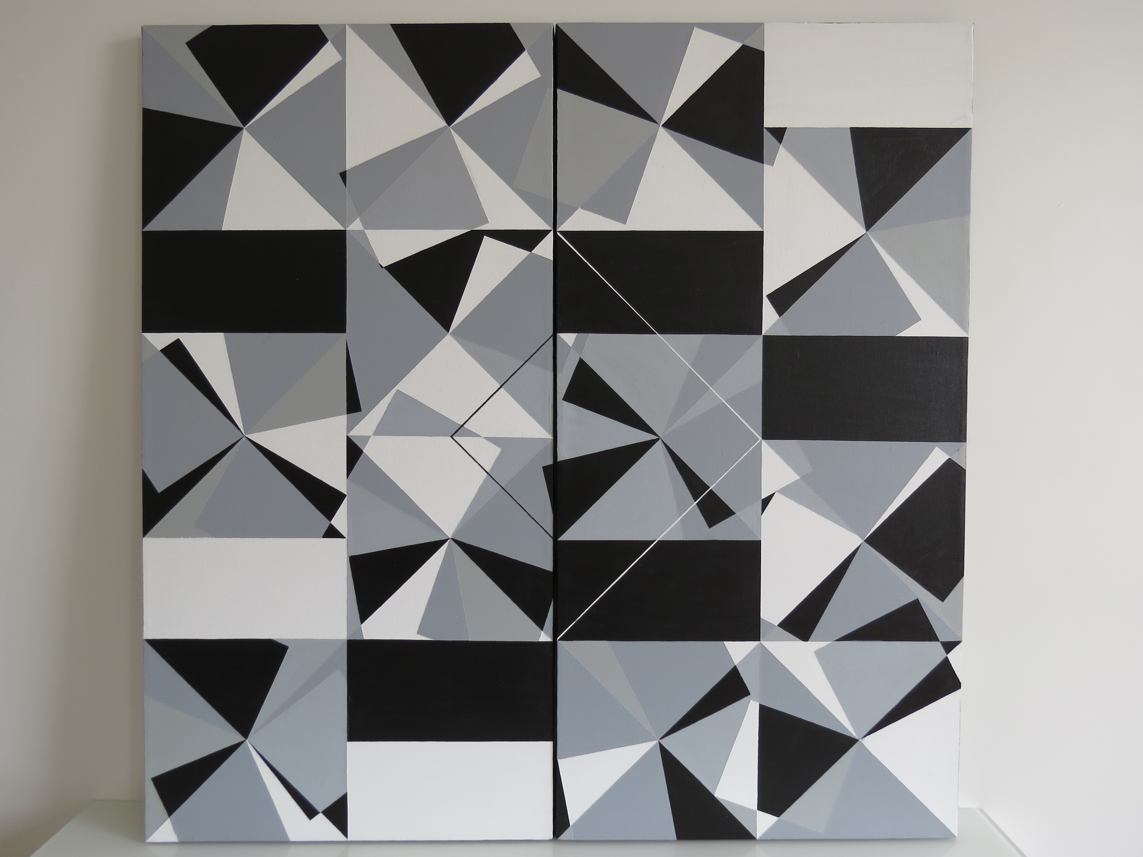
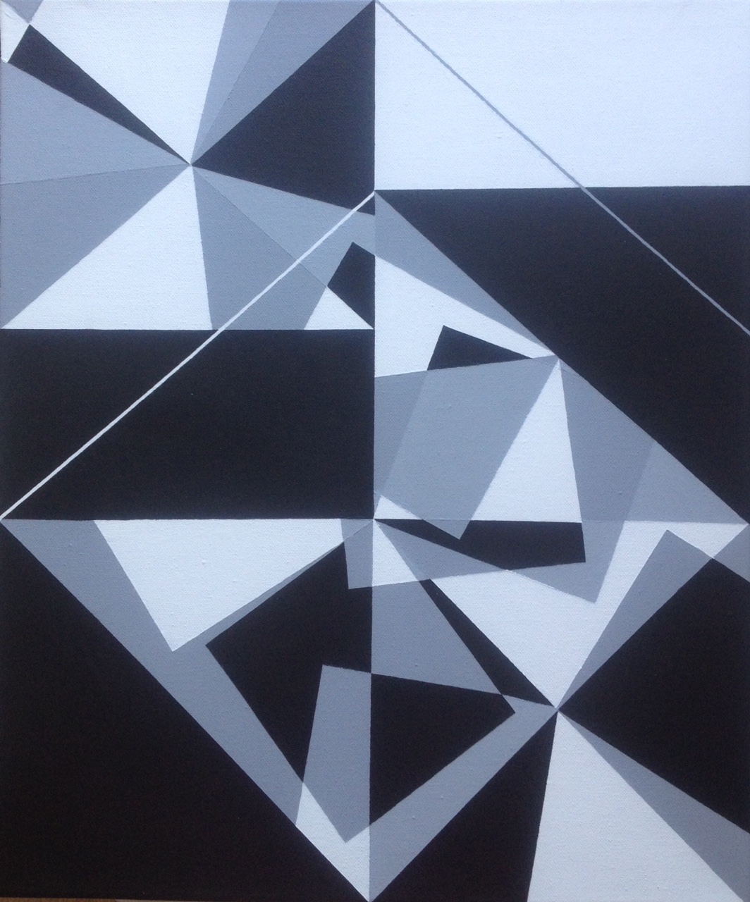
Diptych, untitled, 100×100 cm, June 2016 Untitled, 46×55 cm, May 2016
Paris, March 6, 2016
Black and white continues to dominate. Below a series of six medium-sized paintings.
Untitled paintings, 33 x 41 cm, March 2016
Untitled paintings, 38 x 46, March 2016
Paris, February 20, 2016
This is a large format of my work on black and white. It countinues the previous series.
Untitled, 100 x 100 cm, February 2016
Untitled, 46 x 55 cm, February 2016
2015
December
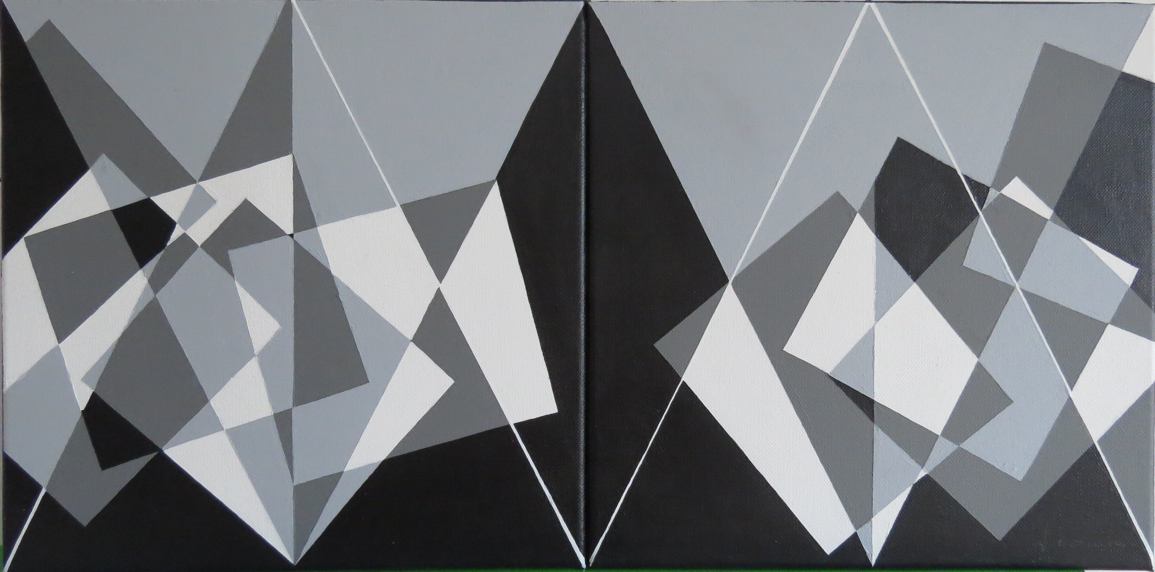
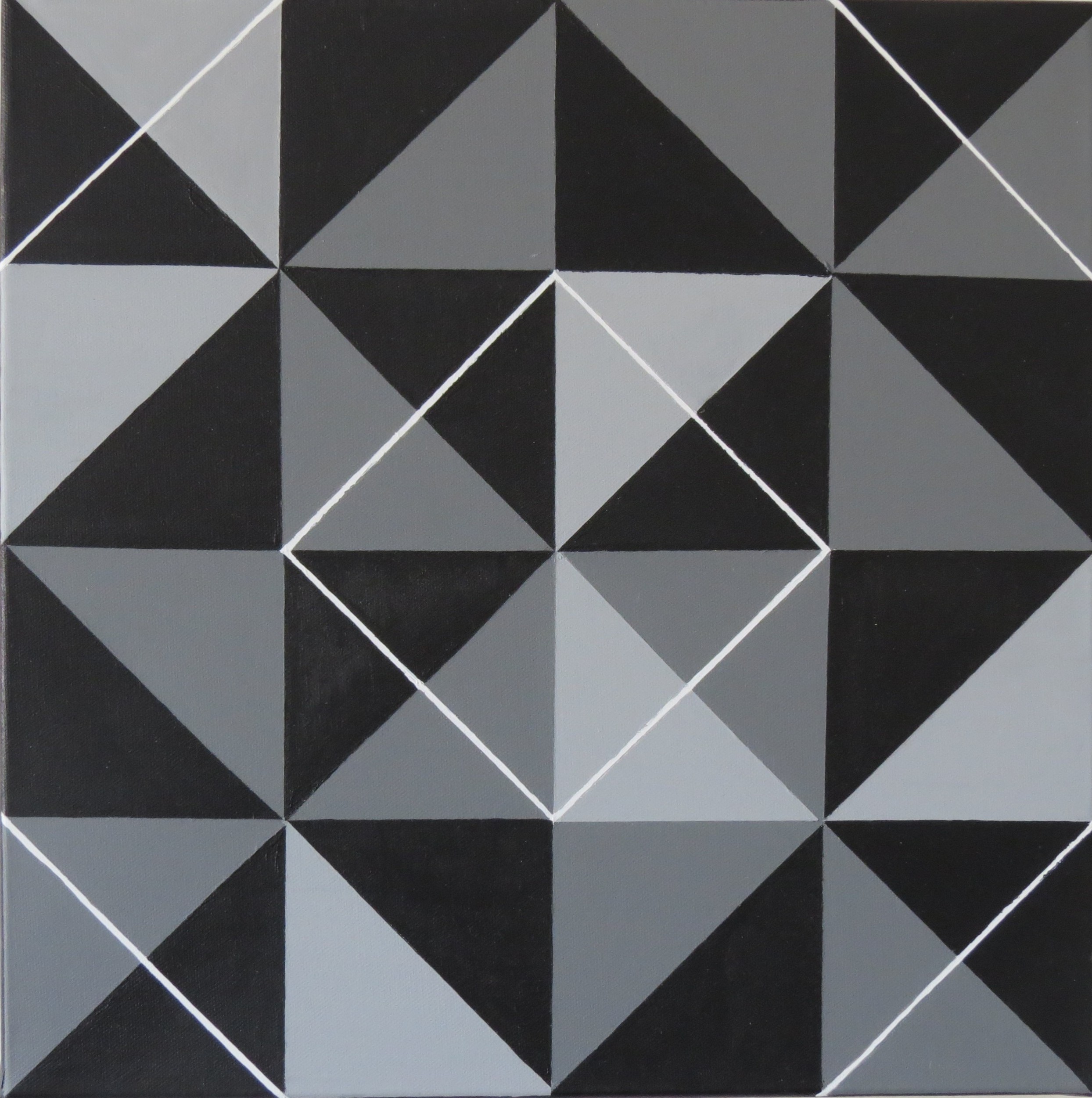
This is a series of paintings focusing on black and white gradation. Some of them are diptychs. The conjunction of two rectangular canvasses is the starting point of the compositions. The paintings are split evenly in the vertical direction, and crossed by diagonal lines. On these layouts fluid quadrangles give the compositions their rythm.
Untitled, diptych, 2 x 60 x 30 cm Untitled, 46 x38 cm
Untitled, diptych, 2 x 30 x 30 cm
November
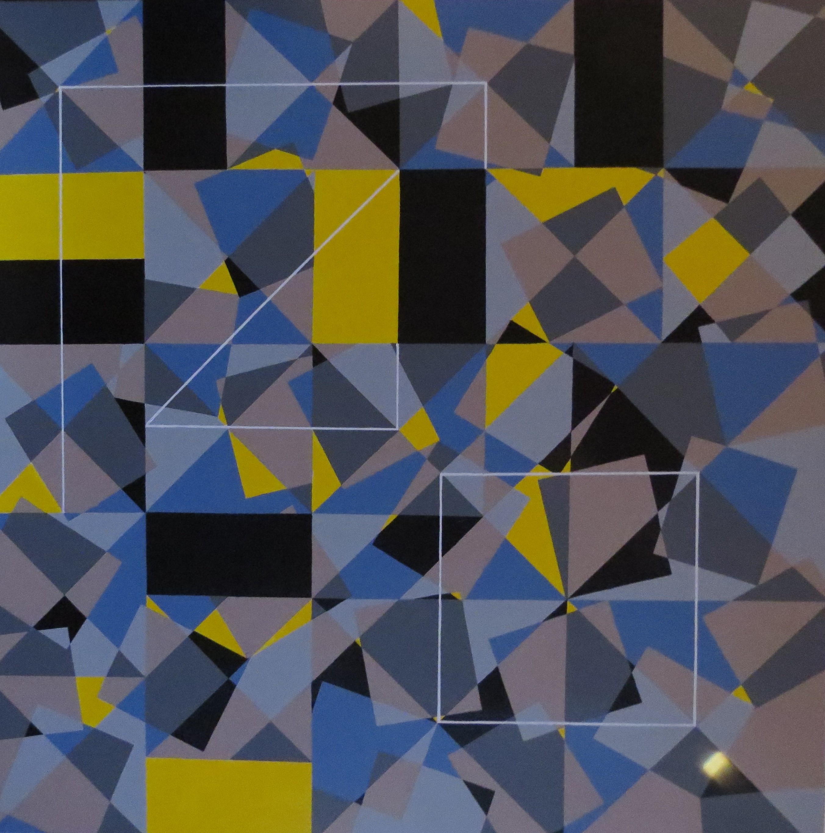
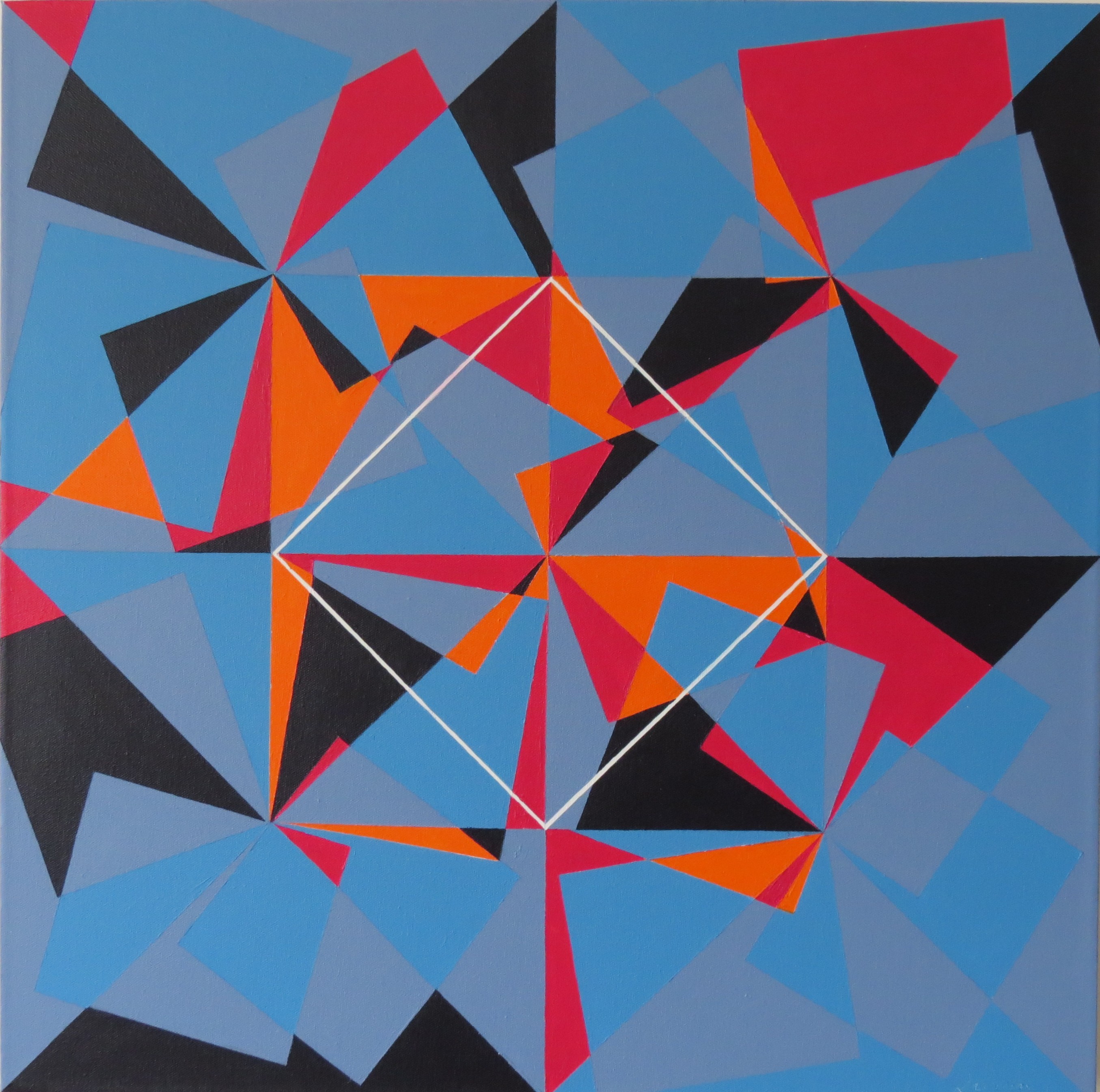
The 100 x 100 format allows me to take my research a step ahead. The space is further subdivided and becomes assymetrical. Rectangular blank spaces disrupt the spatial organisation. These colored rectangles are placed randomly, producing a rythmical effect not unlike notes on a music sheet. They are also emply spaces that shake up the basic structure of the painting. White lines recall part of the original framework.
Untitled, 100 x 100 cm, November 2015 Untitled, 100 x 100 cm, October 2015
September
The white lines are used here to stress the unfinished character of the main structure of the painting. It also completes it. The aforementioned structure consists in horizontal squares with diagonal squares superimposed on them. In addition the global symmetry is challenged by colored rectangles that « shift » the original squares. The combination of all these effects gives each painting its dynamics and its movement.
Untitled, 50×50 cm, August 2015
Untitled, 46×38 cm, July 2015 Untitled, 55×46 cm, July 2015
This effect of rearrangement of shapes in space is what ultimately gives the painting its definite character.
Untitled, 40×40 cm Untitled, 50×50 cm Untitled, 30×30 cm
Above : three paintings from July 2015.
July
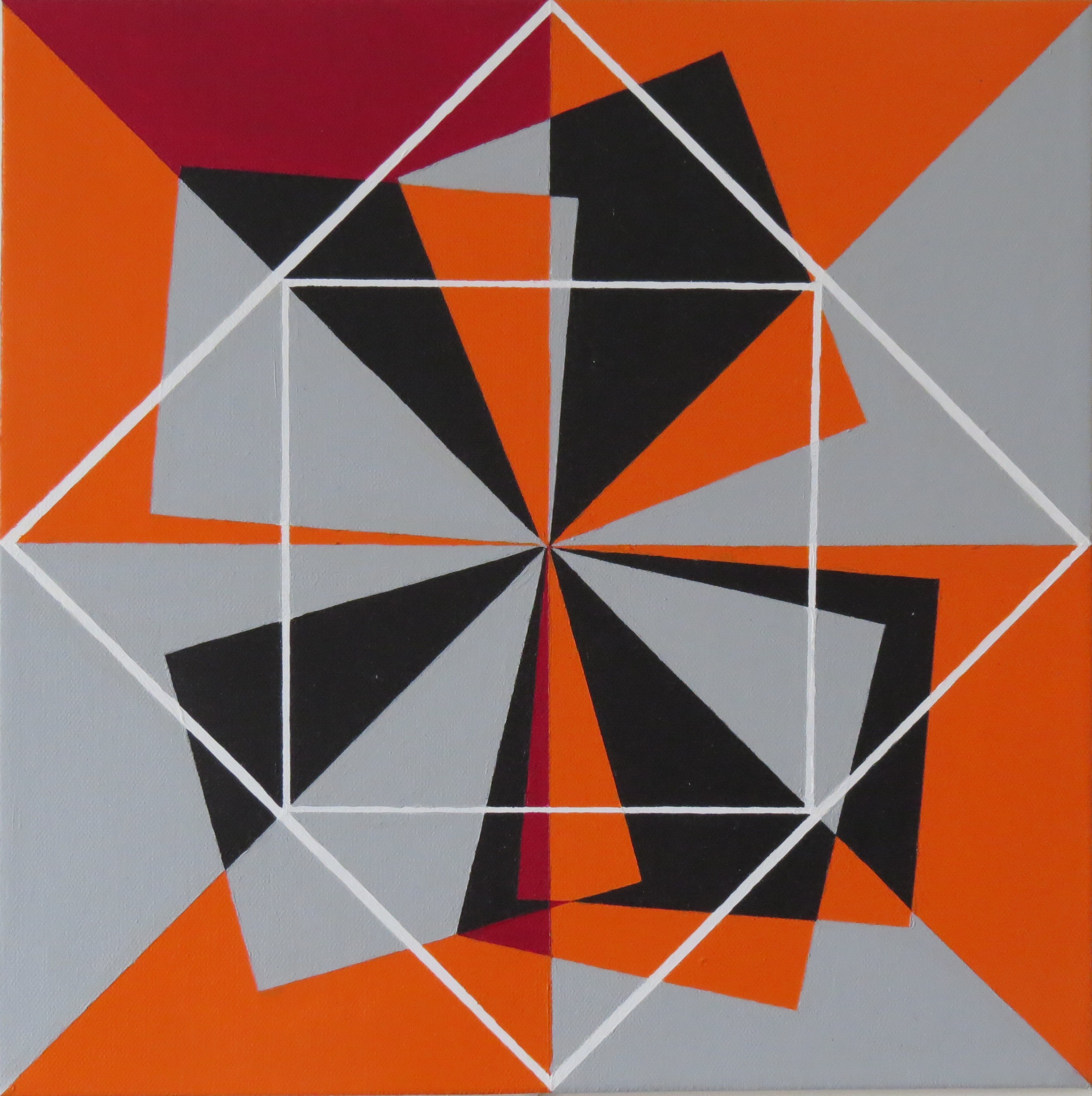
With these new paintings, I explore rectangular formats while continuing my work on the square shape and its variations. The white square sitting on its corner structurates the space, but is it always needed ? I partially remove it on one of the paintings, thus creating an apparent assimetry.
 a
a 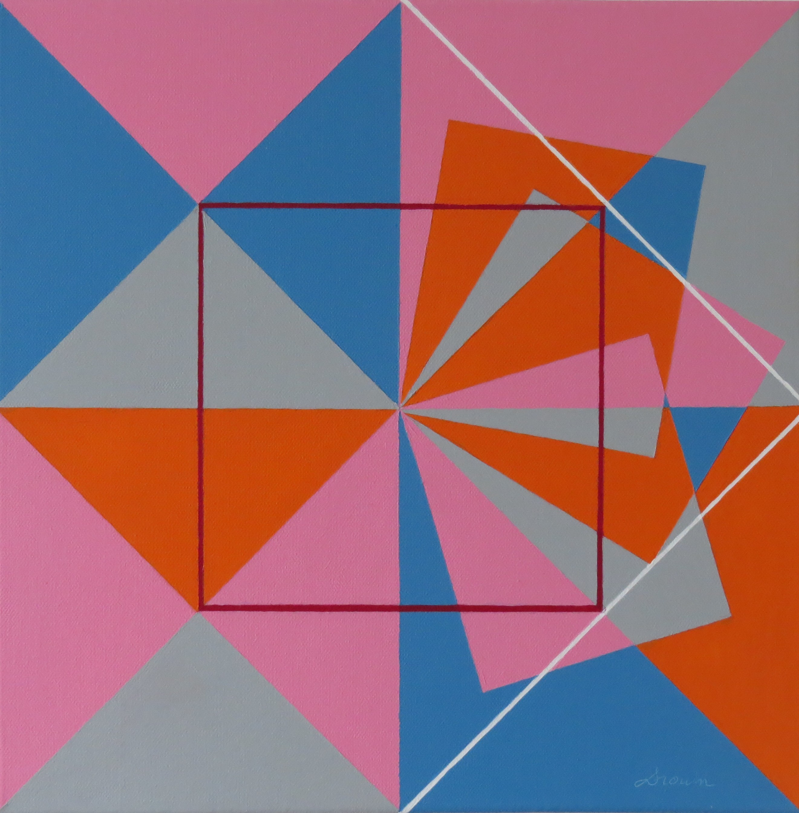
Untitled paintings, 40 x40 cm, June 2015
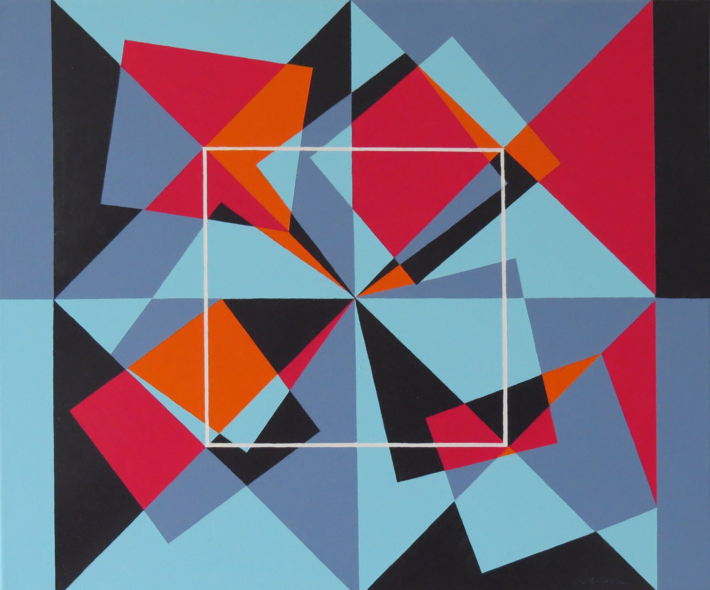
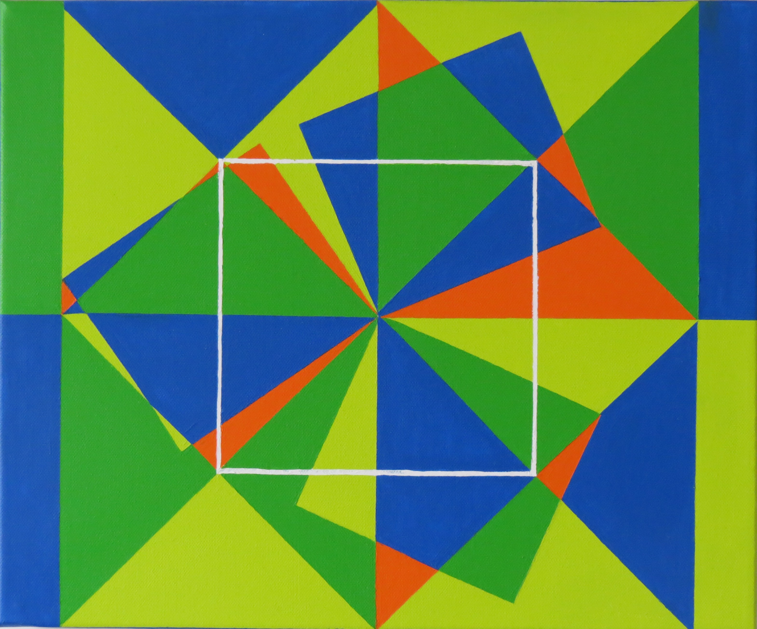
Untitled, 40 x 50 cm, May 2015 Untitled, 40 x 30 cm, May 2015
May
Untitled paintings, 40 x 40 cm, April-May 2015
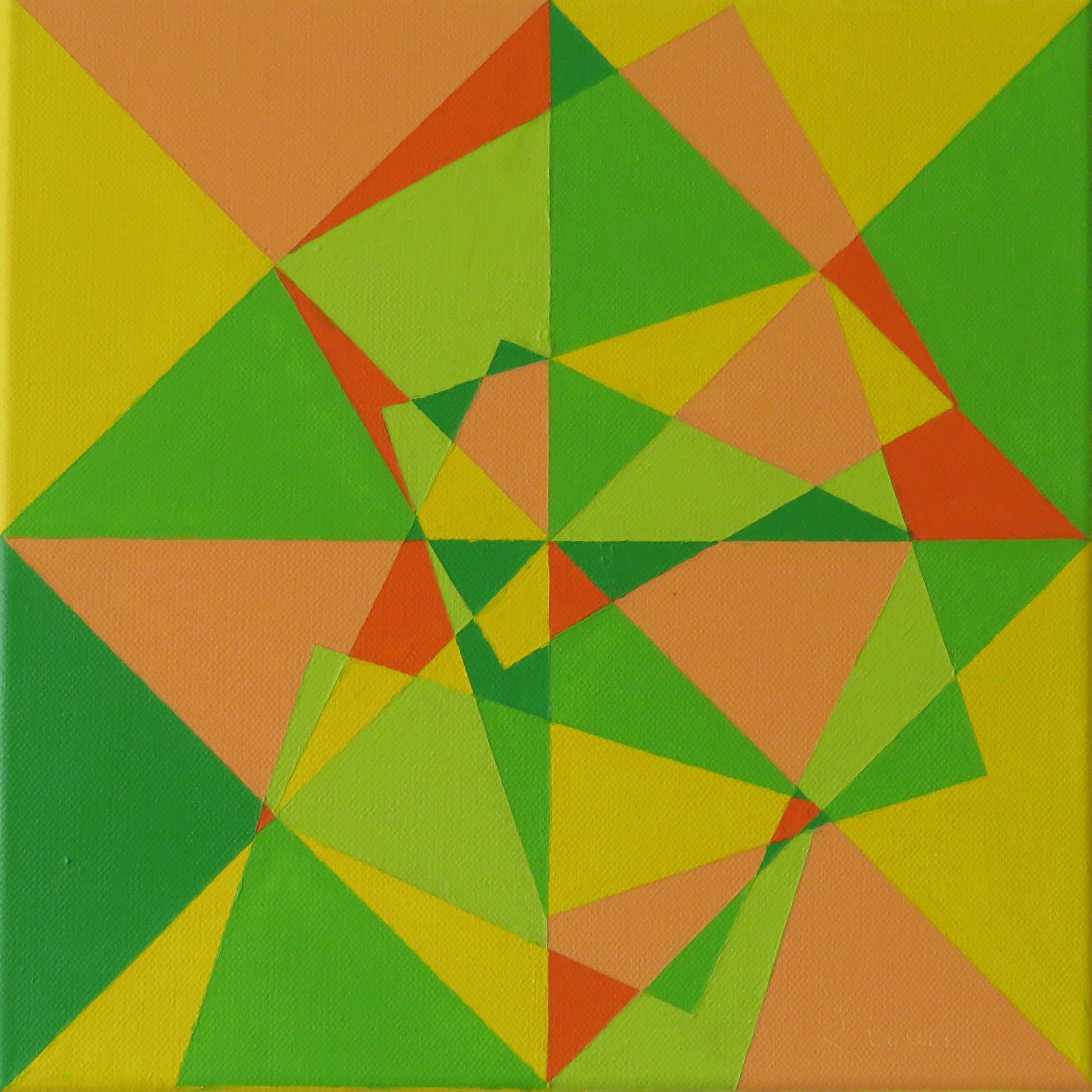
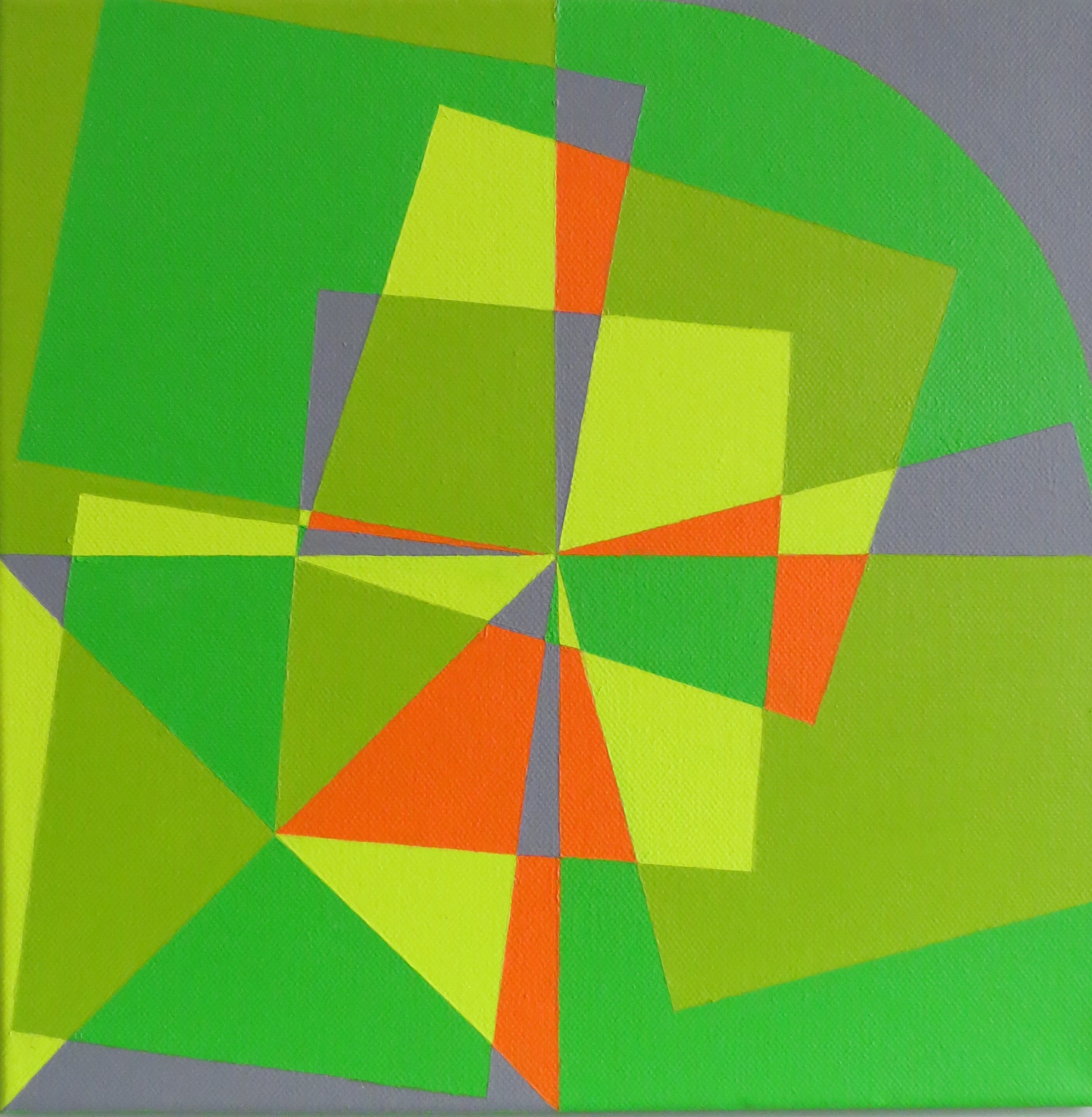
The organisation of the composition is here simplified. I removed the 14/12,5 rectangles that were randomly placed on the painting. These rectangles originated from the center of the painting, magnifying the explosive effect. In this series, only the square-based frame remains. The square are made visible through triangles. The latter are defined by tint areas, irregularly placed. Finally the white shadow of a square reinforces the frame.
April
Untitled, 80 x 80 cm, april 2015 Untitled, 80 x 80 cm, march 2015
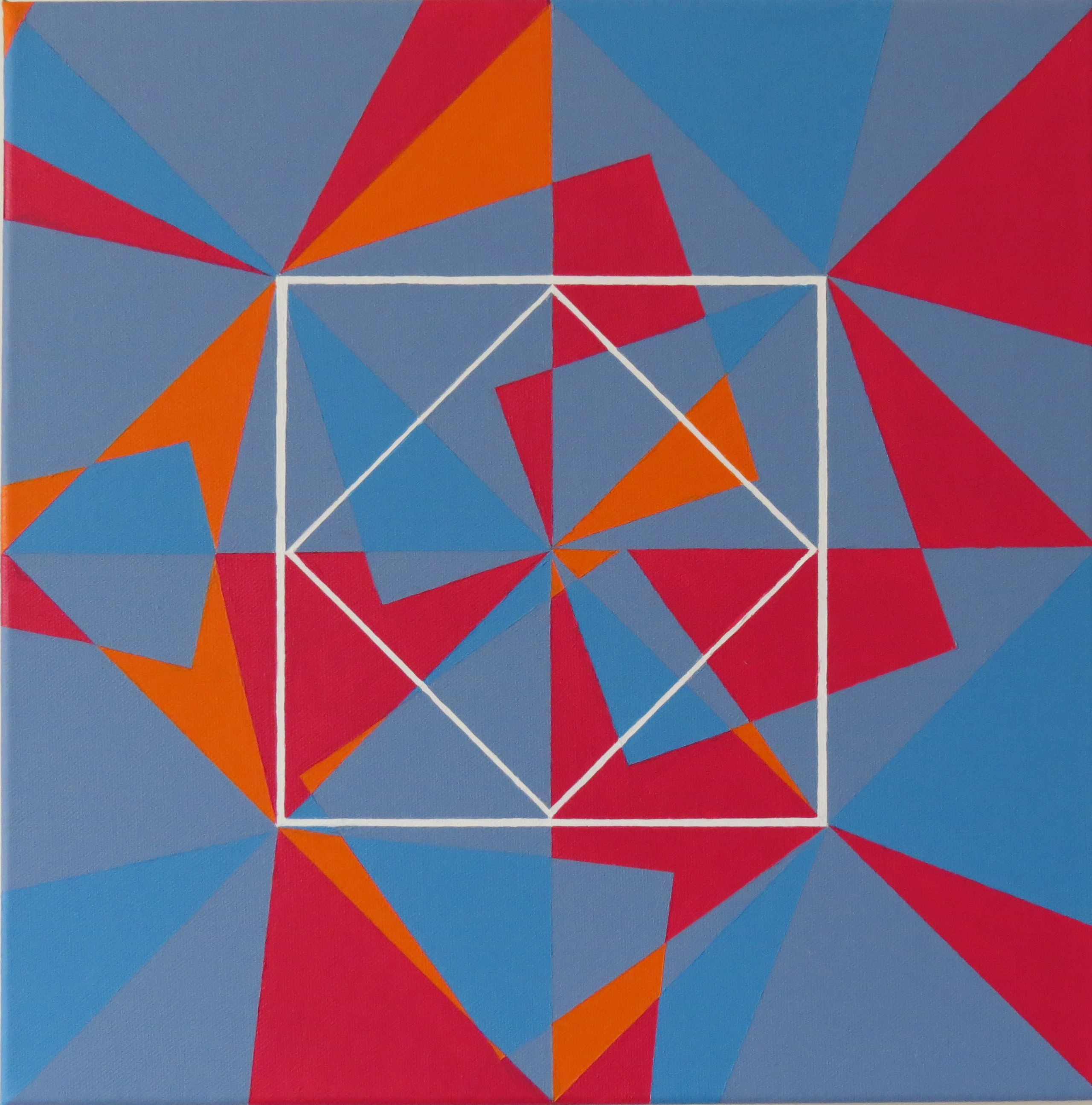
Two diagonals, originating from each angle, organise the space. These diagonals are again intersected with shapes. squares start from the center of the painting towards the outside, creating a centrifugation effect. This is underlined by the fractioning of the spec and the work with the colors. Finally another square structures the surface, reminding the viewer of the painting format.
February
I create shapes and I apply colors. Color gives life to the organisation of the contours of the body of the work. This is how the composition comes to life. In this series, the rectangle progressively gives way to the arc of a circle.
2014
December
The french version of the website displays a recent text from the art critic Fernand Fournier about my work. Click on the french flag on the top right of this page to access it.
November
October
In this suite, the design is in two steps :
Firstly, the space is split by a set of lines. This fragmentation generates a shape or a directional movement.
Secondly, geometric shapes are inserted in this frame and split by the crisscross of lines.
The spectator is then confronted to a superimposition of elements that give him a glimpse of different arrangements depending on the chosen viewing angle.
July
Following a phase of lyrical abstraction that had kept however focused on shapes, my work is now shifting to what is called « geometric abstraction ».
As I am influenced by the constructivist and suprematist movements, I tend to use calibrated rectangular shapes. Starting from such rectangles and their superimpositions, I generate new shapes. From the intrication of such shapes, combinations, universes are born, made of triangular spaces interacting with each other through colors, lines, empty spaces.
The color palette I use is based on pure and complementary acrylic tinges, avoiding the utlisation of so-called primary colors, although this process suffers some exceptions in my work.
A straight white line sometimes crosses all over the painting space, adding a rythm to the composition of shapes and colors.
In the preceding years my work was focused on what is called lyrical abstraction. The arc plays a key role in the painting’s composition. With this new geometric set of paintings, the round shape reappears as well as the color white. This time it is not used as a base for the color mix but as a tint area.
I am always in search of elaborate and equilibrated compositions. Here the work is born only from these marqueted elements.
What appeared initially as a uniformisation then disappears. Once we have established those differences, we cannot deny the existence of a real organisation of the composition. It is the consequence of the juxtaposition of elements, showing a composition of solids and voids.
Monochromy does not mean the negation of color. On the contrary white permits the unicity of the composition, while revealing the depth of the marquetery, un subtle game of light and shadow. White then becomes a palette of whites and greys.
